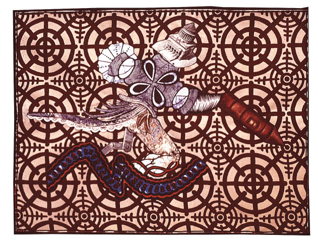
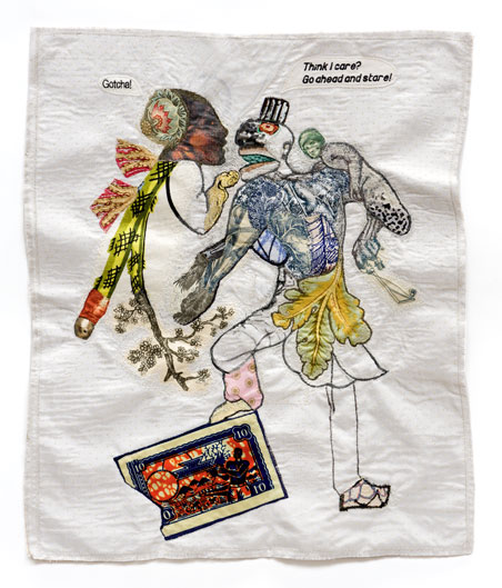
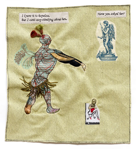
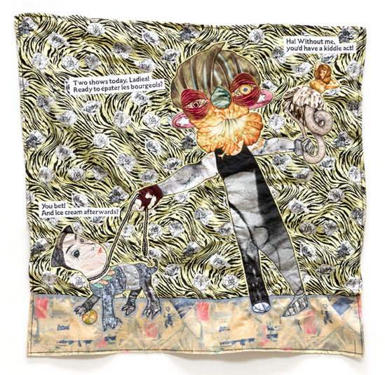
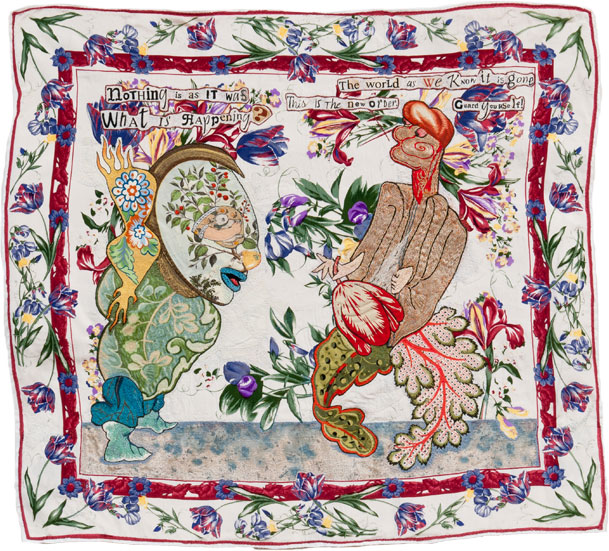
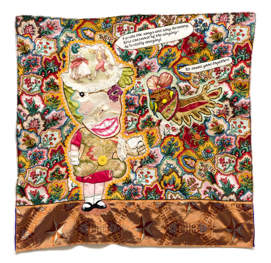
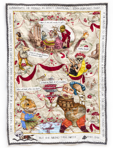
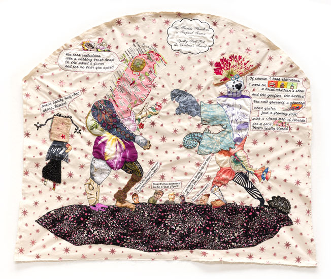
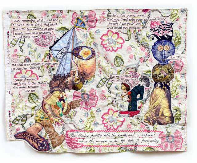
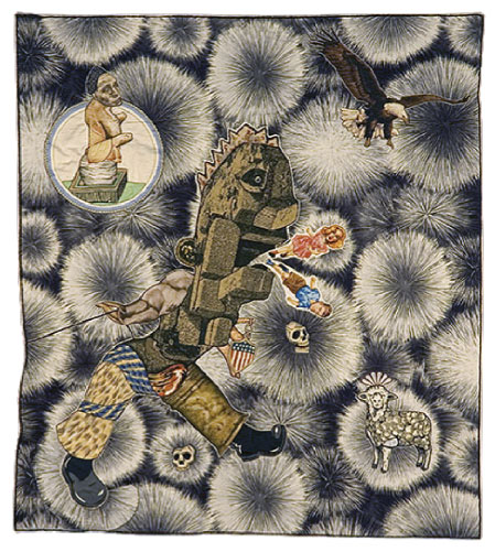
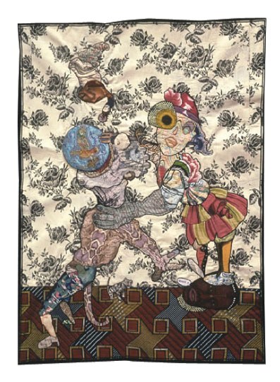
20" x 36"
Fabric, thread, silk-screen ink, metal button, fusible ahdesive.
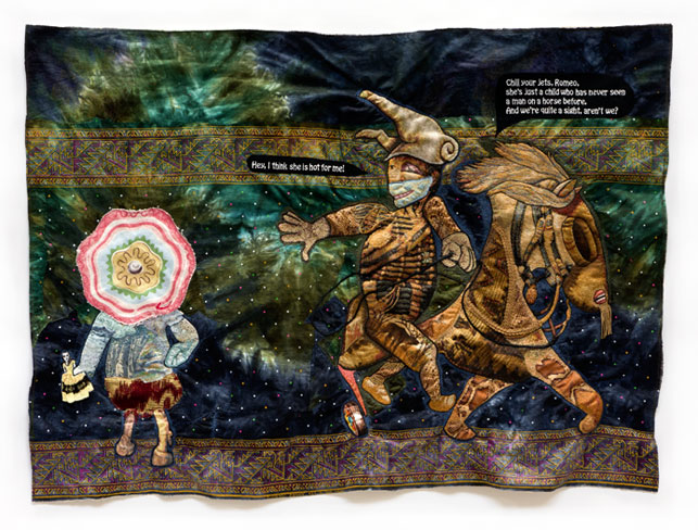
War Dandy
(December 2018 Drawing of the Month)
Though clearly assembled from disparate parts, the War Dandy is fully alive. Simultaneously, he is a mechanical man. Either way, we see him in motion, going in for the kill. The wax print background offers many targets. He himself wears a target on his back and knows that someday someone will take aim at him.
The War Dandy is a jaunty fellow wearing lace and feathers, a ruffled jacket and patterned breeches, aiming a missile, plugged into a control center. His head is for show, just to let the world know who is really in charge—the usual suspects dressed in uniforms and expensive suits, not the War Dandy, who does what he’s told.
When things get too bloody, they order in machinery to dig mass graves.
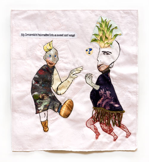
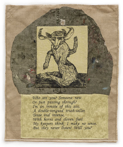
18" x 16.5"
Fabric, thread, silk-screen ink, old painty sweatpants fabric, fusible adhesive, brass trim.
So What!
(November 2018 Drawing of the Month)
I can no longer remember exactly how I came to make So What!, but it is a merry goof that still delights me.
Behold the dance moves of a long-coupled couple in the throes of realignment. Their bodies seem to have been put together from a mess of spare parts but could not be otherwise. If one has four legs, he must need all of them. If the other has only one arm, she must not need another.
They cavort against a light pink background, signaling the domestic sphere, intimate interchanges, delicate transactions. Thus her metaphorical declaration about a melted Dreamsicle could possibly mean that the fierce passion they shared has dissipated and she misses it, that she would like to get it back. I say possibly because that phrase came out of her mouth, not mine. At some point in their facture, my drawings come alive and start talking and then it is like taking dictation.
The guy with four legs is the silent type. But you can tell that he’s thinking about what she said and maybe wondering what he can say that won’t make things worse. Or perhaps he never realized until now that he used to be a Dreamsicle and he can’t imagine how to return to that much-desired state. Even if he would like to. In which case, would she consider another option? But my drawing preserves them as they are at that moment and as long as we look at the drawing, we are there with them, which causes me to laugh and throw up my hands. What a goof!
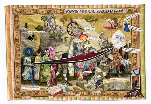
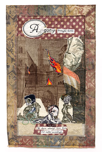
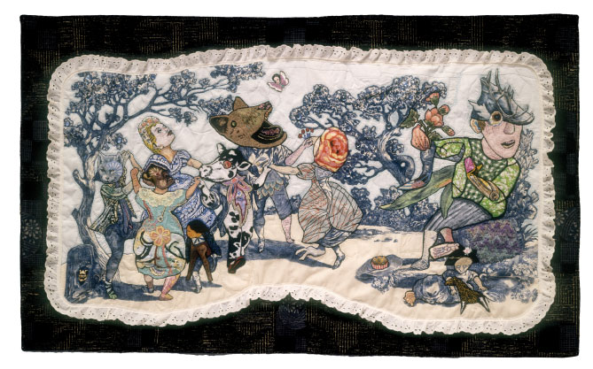
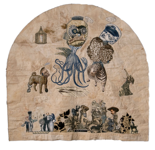
37" x 55"
Fabric, thread, lace, sreen-printing ink, brass rings, aluminum washer and stamped part, plastic goggle-eye, jade glue, fusible adhesive on a a very bad contemporary tapestry copy of Giotto’s Flight into Egypt.
Have You Heard the News Today?
(October 2018 Drawing of the Month)
In 2015, people were fleeing Syria and elsewhere in the Middle East in a desperate attempt to escape the fighting which was not only killing many non-combatants, but also causing extensive political and economic chaos. European states and the Americas were not prepared to deal with how many refugees there were and how much help they needed and for the most part did not want to deal with it.
Around the same time, the company from which I buy the tapestries that I collage and sew/draw to make into drawings offered me a bargain price on a flawed, oversized copy of Giotto’s fresco depicting The Flight into Egypt. Even without the flaw, it was a terrible copy. Besides, Giotto’s figuration is a little too early for my purposes. But The Flight into Egypt shows Mary, Joseph, and the baby Jesus fleeing Herod’s soldiers. Given what I was hearing and reading about every day, that hit home. So I asked the company to send the tapestry.
The drawing I made from it was fractured and abstracted, stiff, messy and surreal, with Death hanging in the sky like a malignant comet, Baby Jesus asking his mother why God allowed such suffering, a murdered woman lying by the roadside, another of the dead still walking in the stream of refugees, hoping if he could just make it to England, they would never notice, one of the many pieces of dialogue I did not have room to put into the drawing, and an angel wringing its hands in utter despair.
In front of the figures and vegetation I set a kind of abstracted blade, hovering there, hard against soft, to embody the inexorable fact of endless, unimaginable suffering and the equally profound indifference of most of the world to this pain and what was causing it. Three years later nothing has changed.
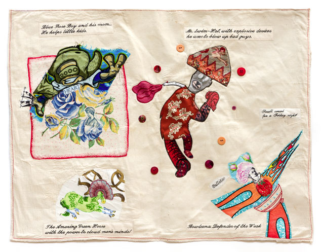
26.5" x 34.5"
Fabric, thread, buttons, plastic beads, Jade glue, fusible adhesive on an old hand-embroidered muslin tea towel.
Lesser Known Superheroes
(September 2018 Drawing of the Month)
This drawing started as a riff, a goof, a piece of light-hearted speculative play, prompted by recent popular interest in superheroes, old ones, new ones, and newly revived ones in films and comics. “You want superheroes? I’ll give you superheroes!”
The ground of this drawing is a vintage tea towel I bought in Kansas City in 2011, bordered in red, with a bowl embroidered in red in the lower right hand corner. To make the superheroes, I used whatever came to hand, mixing and matching with abandon. I gave my heroes ridiculous names and sometimes silly or inappropriate powers. Foul-mouthed Bowlena supposedly defends the weak, but it isn’t clear exactly how she does that—with her flame-thrower? And what about Blue Rose Boy? He is seen here with his mother because he’s too young to go outside on his own. And like most small boys, he has energy to burn, but how does that help little kids? Mr. Swim-Hat’s guided explosives and the Amazing Green Horse with his mental powers seem more like the real deal.
Nonetheless, before I was done, I believed in all of them. It turns out that Blue Rose Boy has a heart so big that he can do anything—and his mother helps him. As for Bowlena, she won’t let anybody get hurt on her watch! Nothing will stop her from fighting evil! I learned all kinds of things about my superheroes in the process of making them: that, for instance, when he’s not blowing up bad guys, Mr. Swim-Hat dances salsa and that Bowlena has come from the future to try to keep that future from happening.
An amazing lot! It was a real pleasure to meet them.
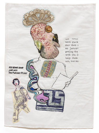
20.5" x 17"
Fabric, thread, screen-printing ink, residual marker, fusible adhesive on an early 80’s screenprint on dotted swiss of my first etching (c. 1968) which I then drew over with markers and did small amount of hand sewing, also in the early 80’s.
The Secret Sharer
(August 2018 Drawing of the Month)
Late in 2016, I re-discovered one of my failed experiments from the late 1980’s, where I had printed an old silk-screen onto fabric, then drawn over it with magic marker and then done a little hand-sewing, before stuffing it into a box and forgetting about it for twenty-odd years.
I wish I could say that when I found it, I finally knew what to do with it. But I didn’t. Fortunately, these days, that doesn’t stop me. I just begin. In this case, that meant first undoing everything I could, unpicking stitches, erasing pencil lines, and then starting over, collaging over what remained and extensively sewing into it, undoing, and re-doing as needed. By such means, the lost was found and redeemed; that is, I found a way to turn a pathetic little reject from the 1908’s into a very nice, somewhat strange contemporary drawing.
Part of its strangeness is that you can’t be sure exactly what is going on. The big guy has been caught in the act of what? From the evidence, it seems to involve foreign money. Whatever he’s done, he doesn’t seem ashamed of it. But the angel, if that’s what she is, filled with righteous indignation, won’t let him off the hook.
Nevertheless, I’m rooting for the big guy. He owns his world. Even though I’m the one who made him, I can’t help admiring the richness and complexity of his upper body and his sheer bulk in relation to everything else in the drawing. And what about the strange creature clinging to his right arm, staring fixedly at the angel? It ain’t over yet.
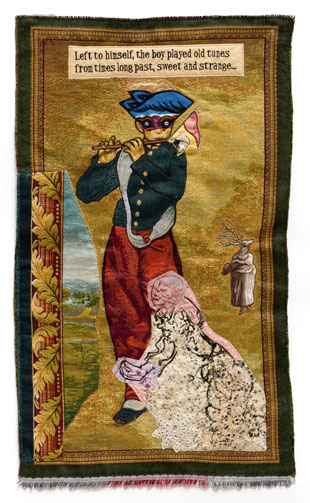
38" x 16.25"
Fabric, thread, screen-printing ink, lace, fusible adhesive on a contemporary tapestry copy of Manet’s The Fifer.
Summoning the Past
(July 2018 Drawing of the Month)
This is one of a series of drawings, begun in 2014 and still ongoing, using contemporary tapestry copies of various 13-20th century paintings, famous and obscure, which I collage over and sew into and then write dialogue and/or commentary for, which my computerized embroidery machine sews out to enrich what my process of doing, undoing, and re-doing over days and weeks transforms into new drawings.
Summoning the Past was originally a copy of The Fifer by Manet and kept more of the original in becoming a new drawing than many of the others. The boy still wears a uniform and plays the flute. But now he wears a mask and a bright blue hat with two cockades and plays his own tunes. The music must still be some kind of a march, albeit an exotic one, because it has conjured a flag-waving Chinese soldier from thin air and frog-marched him out of the end of the flute. But that’s the least of it. Such is the power of the music that the young piper plays that it has split the barren parade ground behind and to the side of him, bringing a vast, rich landscape into view. And as if in a trance, two figures, representatives of times past, summoned by his music, move towards the opening in the ground: a deer-headed woman carrying a basket, and stranger still, a ghostly woman made of patchwork and lace. Meanwhile, the boy remains intent on his tune.
Though we cannot hear it, his music has changed everything, at least for as long as it lasts.
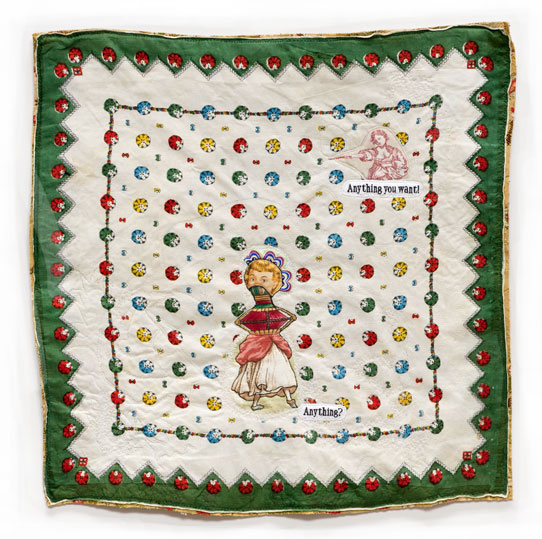
21.5" x 21.5"
Fabric, thread, fusible adhesive.
Anything!
(June 2018 Drawing of the Month)
There was a three-way tie in the voting for the June, 2018, Drawing of the Month. I decided to write about Anything! because though I hadn’t looked at it for years, when I did look at it again, spare as it was, I found it to be so compelling.
In that drawing, a fairy godmother is granting a strange little woman anything she wants. Anything? What options does she have? Without a mouth, the little woman cannot say what she wants, and without arms, she cannot reach for it or point to it. The woman is further confined inside a grid of patterned disks, the grid fenced by rods and disks, held fast by a border of green saw teeth pointing inward, the pattern on an old scarf I bought years ago in Kansas City and fused to white sheeting to use as a ground for this drawing.
It might not matter so much if the little woman never had a mouth or hands and arms and didn’t know anyone else who did, but I happen to think that she didn’t always look so strange, and that however it happened, her transformation into an armless dancing dolly wearing tiny pointed shoes still bewilders her. At the same time, she can no longer quite imagine being otherwise.
When I look at Anything!, it makes me think of life-altering changes of fortune, the sudden loss of a job, the onset of a severe and prolonged illness, radical societal shifts, earthquakes that level cities or floods that sweep them away—those terrible times when if a fairy godmother were to grant our wishes, we would ask only to be made whole again, content to have what we always had.
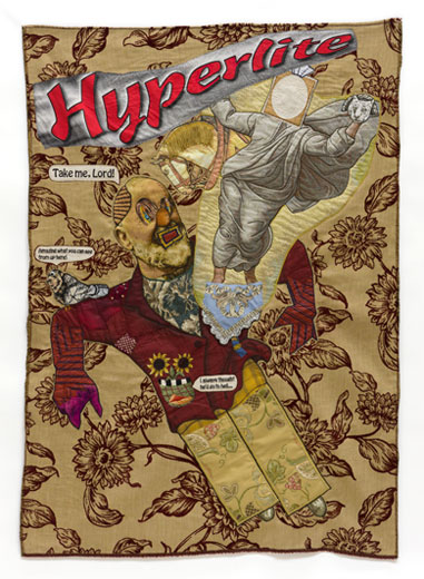
48" x 34"
Fabric, thread, screen-printing ink, plastic goggle-eye, bakelite washer, fusible adhesive, Jade glue, incorporating a contemporary tapestry copy of an unattributed 20th century portrait of Padre Pio and a contemporary tapestry copy of a detail of Raphael’s Transfiguration.
Burnt Offering
(May 2018 Drawing of the Month)
Usually, when I make a tapestry-based drawing, I collage and sew into a contemporary tapestry copy of a 13th-20th century painting and then add dialogue and commentary that I’ve written and embroidered out. Burnt Offering was an exception in that I took two small tapestries, one copy of a detail showing the risen Christ from Raphael’s Transfiguration, the other a copy of an unattributed 20th century portrait of Padre Pio, an Italian saint, and embedded them in an exuberant print of dark red sunflowers strewn on a gold ground that I had bought at the Fabric Mill on Long Island years before, hoping to use it for something, anything.
The portrait of Padre Pio was transformed into the head of a dubious character literally and figuratively offering himself up to God. In the drawing, we can see him rising up through the floral ground to meet a faceless deity, oddly neutral in affect despite his animal companions. A man-headed bird perched on the sinner’s shoulder remarks on the altitude, the face on the pocket of his jacket is surprised that he didn’t end up in hell. But something is really happening because his body has begun to empty out of his clothing...
At the top of the drawing is the single word: HYPERLITE, printed in display type on a piece of fabric that I found years ago in a shop on Lower Broadway that closed not long after. It must have been an advertisement for something that doesn’t exist anymore, but it seemed the right thing to put in the drawing, since everybody in the drawing is floating as if in mid-air.
What does it mean? Redemption, no matter what? How would I know? I’m not in charge of meanings, I just make the drawings. Maybe it’s only a dream, and the skanky guy will wake up with a terrible taste in his mouth and nothing will have changed at all.
Anything can happen in one of my drawings.
21" x 19"
Fabric, thread, screen-printing ink, residual latex paint, brass trim, Jade glue, and fusible adhesive
Say Something
(April 2018 Drawing of the Month)
It’s an old story, but a good one, with a moral. Silence is not always golden. Ask for what you want. Speak up!
Disqualifying himself before the fact, probably because of how he looks, the green man has apparently never told the woman in the red skirt that he loves her. I think he’s making a mistake, because she might find him a nice change from the suits she meets at the office. Funny-looking or not, he’s a hunk, a veritable hotbed of erotic possibilities. And somehow she has already gotten the message: that is, she knows that he is interested in her. We can tell. But he may prefer to suffer in silence rather than court a woman who might reject him. Some people are like that.
What I like best about the drawing is the way the big man’s passage through the drawing is made evident by the perturbations of the fabric. And how the small size of the woman seems to express her inaccessibility, incompatibility, preciousness. As shown, she might even represent how he thinks of her rather than the woman herself. I am also pleased that the drawing shows the green man unburdening himself to a statue of Cupid, who mirabile dictu! answers back.
Anything can happen in one of my drawings.
29.5" x 18"
Fabric, lace, plastic beads, jade glue, and fusible adhesive
In the Ruined City
(March 2018 Drawing of the Month)
By 2015, whole cities of the Middle East were in flames, people who led civilized and productive lives there for generations had to flee, abandoning homes and possessions, going wherever they could. Some who were too sick or wounded or opportunistically drawn to steal what had been left behind had to shelter in place.
In the Ruined City turned out to be about that. This drawing was nothing I intended to do. It happened by itself and I was made more than a little uncomfortable by what it became—too naked, too earnest. To a certain extent, all of my drawings take charge of themselves as they come into existence, In the Ruined City more than most.
The text and imagery were deliberately somewhat crudely patched together to reflect the provisional lives of those left behind in the ruined city. One man loots with single-minded intensity, someone in the center is dying of a head wound, and a third man has a bad leg that slows his progress. Behind them, the first bomb has just exploded and the city is beginning to catch on fire. We cannot see the plane that dropped the bomb, but it must still be overhead.
At the time I could not help thinking of how easily and brutally whole cities, centers of civilization, places of serenity, order, love, brotherhood, commerce, culture, joy, devotion were being destroyed. Of course, every city on this planet will die sooner or later, in one way or another, homes and businesses into heaps of dust or consumed by flood or fire. Entropy will win. Not yet, not soon, I hope. But why help it along?
23" x 20"
Fabric, lace, thread, silk-screen ink, and fusible adhesive
Exit Ahead
(February 2018 Drawing of the Month)
Exit Ahead is one of three drawings I made in 2014 incorporating questions sent to me by the poet H. L. Hix. I had asked him to send sentences or phrases from his poems.
It was Harvey’s idea to send questions, which for some reason pricked me like little knives. Stylistically, this is the most manic of the three pieces, which has a strange effect on the subject matter, which is nothing to laugh about. Nevertheless, Exit Ahead offers the end of life as a kind of vaudeville skit. Time might be running out for this man in all kinds of ways, but like the critter in the cartoon, he thinks he can keep going if nobody says stop and he doesn’t look at the prompt. It doesn’t matter. Time also never stops, and it has already begun to have its own way with him: the poor fellow has the lined face and fluttering hands of an old man, wears sunglasses over age-dimmed, rheumy eyes and an old man’s hat, and has one leg already stripped of clothing. He’s half-dead already, I’d say, not that anyone asked me. But warmed by the bright lights, he is still dashing around on stage with all those flowers behind him, and doesn’t want to be reminded!
I wonder how he can ever forget! Because a little distance away stands the exterminating angel, with six-pointed stars for eyes and folded wings of lace etched in gold, serene and inexorable. No matter how fast the man runs or where he goes, the angel will meet him there.
17" x 12.5"
Fabric, thread, and fusible adhesive
Literary Ape
(January 2018 Drawing of the Month)
Literary Ape is one of my Short Subjects, that is, one of a series of drawings that begin when my CAD software converts a jpg of a line drawing—sometimes one of my old drawings, other times a found drawing— into a VP3 file, and then my computerized embroidery machine sews out a stitched approximation of the original with black thread on white or off-white fabric. This time, I scanned a drawing from an old magazine showing someone giving a speech. After CAD converted the scan to a VP3 file, my embroidery machine sewed out a version of it, which I then subverted by collaging and sewing into it. Then I wrote dialogue for the new drawing, which my machine embroidered and I sewed down.
Not much of of the original remains in the final drawing, just some of the chest and neck and left arm and part of a hand, holding his notes, along with a small chunk of adjacent text that was captured by happy accident. But enough is left to make it seem as if the original speaker has never stopped talking.
Except that now, because my collaged riffs and sewn interventions have transformed the original speaker into the very image of an exceptionally big-brained ape, a beast of high intelligence and some refinement, flamboyantly coiffed and nattily albeit oddly and incompletely dressed, a winner of literary prizes and a brilliant star in the sky of our celebrity-mad culture, the ape has entirely supplanted the first speaker. And we are eager to hear what he has to say.
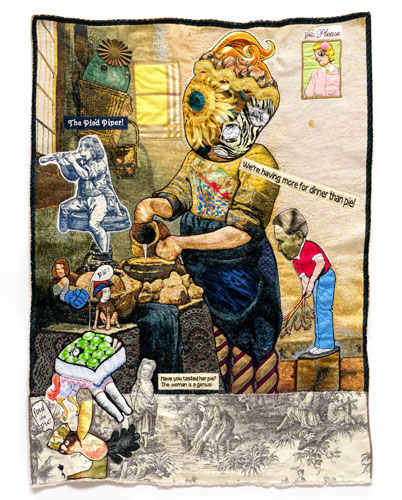
34" x 27"
Fabric, thread, lace metal and plastic buttons, stamped brass part, sequin, fusible adhesive on a contemporary tapestry copy of Vermeer’s Milkmaid
About Dinner at Our House
(December 2017 Drawing of the Month)
I drew Dinner at Our House on a contemporary tapestry copy of Vermeer’s The Milk Maid, rescuing Vermeer’s light and space from the murk of its digital translation and filling it with a whole cast of characters that in my head I labeled either as “family” or “hangers-on” but otherwise felt no need to explain. Despite their eccentricity of appearance and manner, such as the troubadour, for example, suspended in midair, they are united by their appetites. Everybody seems to want to taste the milk maid’s famous pie. The ones who live with her know they have to wait for it. The others don’t.
I added a little window on the upper right to frame another seeker-after-pie. And I sewed down two oversized squares of plaid for a new window on the left, to cast light onto that corner and somehow it does. I am particularly fond of the creature in the basket hanging in that corner who seems utterly intent on the milk maid’s every gesture. He has brass button eyes and wears a stamped brass hat that echoes the petals radiating out around the milk maid’s right eye. The milk maid has become a veritable monument, with a giant gaudy head and lustrous, twisting columns for legs. She commands her kitchen and all who enter it. And she has determined to make this motley crew eat dinner first, before she’ll give them any pie.
The kitchen ends in a drab strip of toile at the bottom, with one of its inhabitants standing to testify to the milk maid’s genius as a pie maker and two rascals on the far left looking to steal some pie.
Both the way this drawing abruptly ends in toile and the extravagant and disparate range of characters were inspired by a visit to Albert Oehlen’s exhibition at The New Museum a few weeks before I made it. After seeing his paintings, I realized that I could up the ante considerably and trust my viewers to make sense of it.
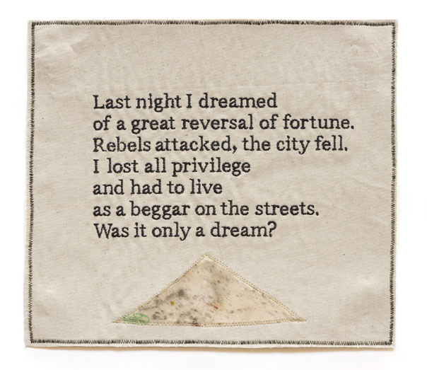
11.5" x 13"
Fabric, thread, fusible adhesive.
![]()
(November 2017 Drawing of the Month)
Last Night is actually a broadside, not a drawing, not that it matters. I made it along with the rest of the art shown on my website and it’s all the same to me. But it is certainly the first of my broadsides to be voted Drawing of the Month, perhaps because it touched a nerve. It was meant to.
In 16th and 17th century England, opinion pieces and late breaking news such as a sensational murder or a runaway coach were printed on full sheets of paper called “broadsides” and sold on the streets. Sometimes popular ballads were sung on a street corner next to a stack of broadsides printed with the words and music, available for purchase. 20th century poets printed their poems on broadsides, with or without illustrations, and some still do.
I started making broadsides in 2013, after a Pollock-Krasner Foundation grant funded my purchase of a computerized embroidery machine and CAD software. Once I could write VP3 files for the embroidery machine to sew out as legible text in a variety of typefaces for my books and drawings, it turned out that I had still more to say. Broadsides provided the perfect format.
I make art to make sense of the world. And Last Night reflects certain aspects of our contemporary world; in particular, the cruel, arbitrary, and disruptive forces that presently afflict so many and might still turn our way. Trouble doesn’t always happen to someone else.
36.5" x 41"
Fabric, thread, silk-screen ink, buttons, colored stones, fusible adhesive.
![]()
(October 2017 Drawing of the Month)
I discovered the vintage drapery fabric for this drawing on the top floor of a building filled with booths selling second-hand merchandise in Kansas City, Missouri. There was enough of it so that Gerry Trilling, a very fine artist and the friend who brought me there, took some of it to use in her work.
In the end, the fabric didn’t engage Gerry and she set it aside. But I found the pattern sufficiently compelling to begin work on a drawing using it as ground as soon as I returned to my studio. It was so rich and further embellished during the process of making the drawing with such a quantity of buttons and colored stones that three curiously constructed figures were enough to take up what room was left.
The woman on the right strides forward with urgent business. On the left, a dog-headed man wearing a skirt has noticed the woman’s agitated condition and expressed his concern. Meanwhile, the big-headed apparition hanging in the center of the drawing like a malignant Christmas tree ornament, simultaneously lustful and ironic, lives only to possess the woman—whatever that means to him. All of this takes place on and in a printed ground generating a cinematic atmosphere of reverie and longing for the kind of false past conjured on stage sets and in camera.
Still the Ghost of Her Clings was my first drawing to incorporate significant quantities of appropriated text. I first used appropriated text in the two one-of-a-kind Black Books I made in 2009 and then again, more flamboyantly, in Pressing Questions, a book I made in the summer of 2010. This drawing came immediately after. Appropriated text continued to appear in my books and drawings until late March of 2013, when a grant from the Pollack-Krasner Foundation funded the purchase of a computerized embroidery machine and CAD software. Since then, almost all the text in my drawings has been digitally embroidered in a variety of typefaces.
|
|
Two drawings I made in 2014 showed romantic love with various complications. Barbara’s Boyfriend featured sniping sisters, The Morning After, a street-smart pig who chafed at the fancy ways of his lover’s friends. We all know of situations such as those.
|
|||||||
|
Birdman in Love, 2014.
17.5" x 13" Fabric, thread, fusible adhesive. |
|||||||||
|
|||||||||
|
|
The Girl in the Flowered Gown is part of an on-going series of drawings on contemporary tapestry copies of 14-20th Century paintings that I variously collage and sew into, subverting both imagery and narrative. Then I write dialogue and commentary which I embroider and sew down. I call the finished drawings "altered paintings," which does not make clear how much was already done to them before I ever laid a hand on them: how badly copied, cropped, edited they had been, how coarsely re-decorated, and finally woven pixelated on digital looms. In effect, just like the rest of our history, they were massively and repeatedly interfered with. In fact, that is why I like working with them.
|
|||||||
|
The Girl in the Flowered Gown, 2015, 49 x 39.5 inches
Fabric, lace, thread, silk-screen ink, button, plastic flower, fusible adhesive on a contemporary tapestry copy of Renoir’s Country Dancing |
|||||||||
|
|||||||||
|
|
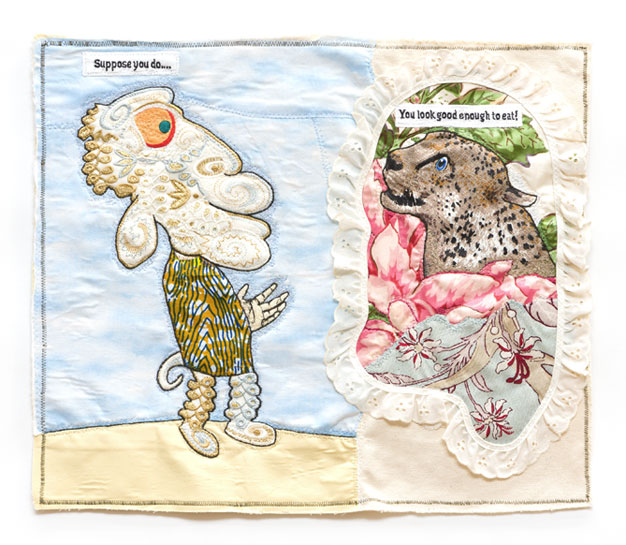
Last year, in one of the boxes on my shelf that I probably should have labeled “machine-embroidery,” but didn’t, I found a piece of off-white polyester lavishly embroidered in gold and blue-gray thread. Parts of the embroidery immediately suggested a sheep-man’s head (except for his eye) and his legs and feet. The head had loads of personality: very sweet, but also silly, credulous, and more than a little vain. It needed only an eye, a tail, a hand, a torso, all of which I found elsewhere among my fabrics, to come fully alive.
|
|||||||
|
Imagining the Worst, 2015
15 x 17.5 inches Fabric, thread, silk-screen ink, fusible adhesive |
|||||||||
|
|||||||||
|
|
Fish Sticks is a Short Subject, one of a series of similar small drawings I’ve made in the last four years. I use CAD software and my computerized embroidery machine to sew out rough approximations of my old line drawings, black lines on a white or off-white fabric, which I then collage and sew into, patching over the parts of the original drawings I cannot use and writing dialogue and commentary, which my computerized embroidery machine also sews out.
|
|||||||
|
Fish Sticks, 2015
15.5 x 11.5 inches Fabric, thread, silk-screen ink, Jade glue, fusible adhesive |
|||||||||
|
|||||||||
|
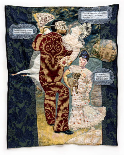
|
Men Are Fools is one of what I call ”Altered Paintings,” an ongoing series begun in the fall of 2014, which involved my collaging and sewing/drawing into contemporary tapestry copies of classic and less-than-classic paintings. Widely available for sale online, edited in a strange and arbitrary manner, woven pixelated on digital looms in a limited range of colors, the tapestries are mere approximations of the original paintings. That’s what interests me about them: that like the rest of our history, they have been so massively and repeatedly interfered with, yet something in them still lives.
|
|||||||
|
Men Are Fools, 2015
36 x 37 inches Fabric, thread, lace, found earring part, fusible adhesive on a contemporary tapestry copy of Franz Xavier Winterhalter’s Portrait of Sissi |
|||||||||
|
|||||||||
|
|
The Act, 2014, is a drawing that I made as difficult as possible for myself without really meaning to. I’d been obsessed with the white-pansy-and-tiger-stripe fabric ever since I’d bought it months before and was determined to use it behind the figures. Somehow that meant that the figuration skewed towards the primitive, perhaps to distinguish itself from the tiger stripes and pansies, except for the snake-woman, whose curves immediately asserted themselves. The clown’s head took two or three tries to get right, but that’s not uncommon with my drawings, which rarely come easy.
|
|||||||
|
The Act, 2014
33.5" x 35" Fabric, lace, thread, fusible adhesive |
|||||||||
|
|||||||||
|
|
Since the Middle Ages, there have been songs, poems, paintings, prints, and drawings showing or telling how Death either seduces or forcibly seizes a young woman, causing her to die. The woman usually appears of marriageable age but virginal. Here is a painting from 1508 on the subject by Hans Baldung. The woman’s pleasure in her own attractiveness seems to make her more vulnerable. Vanitas!
|
|||||||
|
Death and the Maiden, 2015
21 x 28 inches Fabric, lace, thread, fusible adhesive |
|||||||||
|
|||||||||
|
|
This is a favorite drawing of mine. There’s something about the vivid colors of the figures and ground in combination with the edge of the text that pleases me. I also liked constructing the tourist’s unlikely head and arm, keyed to the colors of the landscape, oversized, arrogant, oblivious, and entitled, and substituting it for the rickshaw passenger’s original head. Considering who’s doing the pulling, the pronounced difference in size between the little rickshaw man and his passenger is hilarious and awful and also functions as an an economic metaphor. I had to completely reconstruct the landscape around them, moving boulders, clouds, flowers, bridges, pagodas, and greens, taking out all the birds except one. But that’s how it is with tourists: you must provide the experience they expect to have.
|
|||||||
|
The Tourist, 2015
22 x 30.5 inches Fabric, thread, fusible adhesive |
|||||||||
|
|||||||||
|
|
Given my great need to make sense of the world, it isn’t surprising that I’ve made so many drawings about romance, sometimes showing its pleasures, more often its perils, such as A Foreign Affair, Fruit Salad, Birdman in Love, Barbara’s Boyfriend, and The Morning After. All Kinds of Lost is one of them. The goatherd and his goat-girl find themselves alone in a menacing and alien world. Trying to make the best of it, goatherd shows what a fool he is and only makes things worse. The goat-girl understands and despairs. Given the dynamics of their relationship, I’m not sure that she can do anything to help herself. It may be too late, anyway.
All Kinds of Lost, A Foreign Affair, Fruit Salad, Birdman in Love, Barbara’s Boyfriend, and The Morning After are part of Radiant Messenger, Drawings by China Marks at the Foosaner Art Museum, Florida Institute of Technology, Melbourne, FL, through January 7, 2017. Foosaner Art Museum |
|||||||
|
All Kinds of Lost, 2015
14.75 x 16.5 inches Fabric, thread, fusible adhesive |
|||||||||
|
|||||||||
|
|
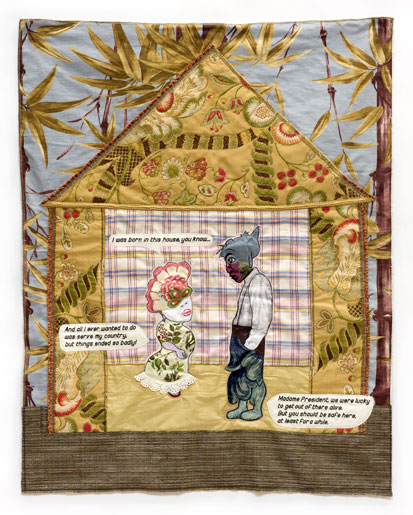
Safe House depicts the inside and the outside at the same time. Safe House is decorative and deadly serious simultaneously, without contradicting itself. The man and woman inside the house live in this moment but are shaped by a real and/or imagined history, some of it explained, the rest implied. Most of my drawings come with back stories, this one in particular. When Safe House was part of an exhibition last year, some people objected to its “plantation mentality.” They saw a white woman giving orders to a dark-skinned servant. Apparently the text didn’t make clear the actual circumstances: that this was all taking place in a small [fictional] South American country, where because of centuries of intermarriage, no one was entirely white, but where the whiter inhabitants tended to have more money and power. Still, it happens that the deposed Madame President owes her life to the man she is talking to, her Chief of Security, mostly Indian, who in the middle of a bloody coup helped her escape from the presidential palace. Her opposition assumed she’d head for the airport and an easy life in Europe. Instead, she went home. That made international news. With the world watching, living among old friends, she’s safe, at least for a while.
Her chief of security has more to worry about. When he refused to change sides, he became a marked man. There’s more, but if you spend enough time with this drawing, it will tell you all about itself, even things I don’t know. Once my drawings begin to breathe on their own, they contain multitudes I did not put there. But even before that, though I work terribly hard at my art, I am not in charge. I would never have thought to make the wall plaid. A suggestion to that effect woke me in the middle of the night, and it was that plaid. So the next day I cut the plaid to size, and it worked. So it goes.
|
|||||||
|
Safe House, 2015
38 x 30 inches Fabric, thread, silk-screen ink, fusible adhesive |
|||||||||
|
|||||||||
|
|
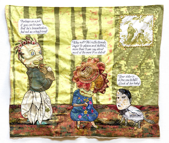
I didn’t plan it that way—I seldom plan anything—but Barbara’s Boyfriend turned out to be fraught with heartbreak and sibling rivalry, with just enough ambiguity to keep me guessing. From childhood Barbara was always a little old maid, short, fearful, and unattractive, pathetically grateful for any attention, but not expecting much. (Grown up, she still looks braced for endless rejections.) Her sister, while no beauty, stood tall, switched her hips and drew men like flies. Though the sisters were always very different from each other, they seem to share an interest in sexual adventurism. But Barbara is more open about her desires than her sister has been, perhaps because it’s apparently the best thing that has ever happened to her. Barbara declares her allegiance even as her boyfriend broods over her sister’s insults. I hope that he is as nice as she says he is. He looks like the jealous kind. Notice how the figures step down in size, left to right and how Barbara’s boyfriend is set apart from the sisters by his black-and-off-whiteness and the shift in the color of the wall. It is not entirely clear if they are standing inside a room or outside in a courtyard. Meanwhile, I cannot help wondering what the couple in the picture on the wall thinks about this somewhat toxic threesome. Barbara’s Boyfriend is one of over fifty drawings from the last three years that are part of Radiant Messenger: Drawings by China Marks at the Foosaner Art Museum, Florida Institute of Technology, Melbourne, FL, October 22, 2016, though January 7, 2017. |
|||||||
|
Barbara's Boyfriend, 2014
32" x 37" Fabric, lace, thread, fusible adhesive |
|||||||||
|
|
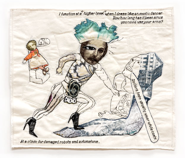
Doctor Drag is one of my Short Subjects, that is, a drawing constructed from an approximation of an old line drawing, mine or someone else’s—in this instance, mine—scanned into a jpg, converted by CAD software into a vp3 file, and sewn out on white or off-white fabric by a computerized embroidery machine under my supervision. I collage into it, use patches of the ground fabric to edit out what no longer makes sense, sew into and add text to what remains. Over time, it becomes something new. I remember being somewhat surprised at the subject of this drawing, a doctor at work, dressed as an exotic dancer, hose, heels, G-string, moustache and all, and deciding to see what I could make of it. I also remember deciding early on to take seriously the suffering of the robots and automatons. I didn’t mind the doctor seeming odd, but I cherished his patients. I took the doctor seriously, too, despite his drag. He might even have been a real doctor who could only work in a place that didn’t care what he wore, as long as he was able to fix the robots. For the most part, the robots didn’t care, either, as long as they were sure that he could fix them. Some people who looked at this drawing complained that they couldn’t understand what the little girl sitting in the high chair in the upper left was saying. She was a very expensive talking doll, I explained, who was talking nonsense and never shut up. That’s why she was at the clinic, waiting to be fixed. |
|||||||
|
Dr. Drag, 2015
12 x 14 inches. Fabric, thread silkscreen ink, fusible adhesive |
|||||||||
|
|||||||||
|
|
|
Somehow I knew from the start that I was going to push things, pattern against pattern, one shape into another with little or no transition. And I’d wanted to to use that swirling print of black and white pansies against stylized tiger stripes for months. It had a certain queasy-making charm. The figures I constructed would have to stand out against it without seeming to. I put together the man’s head mostly out of leaves and flowers, giving it a slapdash symmetry. That relaxed, toothless goofiness took two or three tries. At first I was trying to do too much. And it took a while for symmetry to suggest itself. That’s not uncommon. Even the simplest of my drawings is not simple. The man’s body is much less complicated and less colorful than his head, composed of light and shadow and markedly off-kilter. His dialogue shows the same mix of plain and fancy: carny talk, then a French phrase. I was surprised at how many people who looked at the drawing did not know what it meant. The “Ladies” of The Act provide the contrast: the one on all fours, leashed, playing with a ball, childlike and eager to please; the snake woman all business; both dependent on the man. Nevertheless, the three of them seem to get along. “Seem” is the operative word. Any act worth its salt is an illusion. And typically, the audience for an act agrees to participate in the illusion for the length of the performance. The master of ceremonies and the two ladies of The Act are eager to amuse us in their old-fashioned, stylized, slightly seedy fashion. As a visual artist, I myself traffic in illusion. While my drawings have grown more ambitious and somewhat more oblique in the last two years, I enjoy looking back at an earlier work like this, depicting actors, themselves illusionists, beginning a performance at ease with our gaze, for the most part meaning only to please. |
|||||||
|
The Act, 2014
33.5" x 35" Fabric, lace, thread, fusible adhesive |
|||||||||
|
|||||||||
|
|
|
Last year, in one of the boxes on my shelf that I probably should have labeled “machine-embroidery,” but didn’t, I found a piece of off-white polyester lavishly embroidered in gold and blue-gray thread. Parts of the embroidery immediately suggested a sheep-man’s head (except for his eye) and his legs and feet. The head had loads of personality: very sweet, but also silly, credulous, and more than a little vain. It needed only an eye, a tail, a hand, a torso, all of which I found elsewhere among my fabrics, to come fully alive. I paired the sheep-man with a leopard emerging from a wilderness of flowers and leaves bordered in lace. I knew I had to do something else with the leopard: I had just used up all my sky fabric. But putting the sheep-man against the sky on one side of the page and the leopard surrounded by flowers and vegetation on the other made sense. Offering himself to a lusting leopard that he himself conjured was the sheepman’s masochistic fantasy. Separating the two made clear that it was only a fantasy, that the sheep-man didn’t really want to be eaten alive, however wonderfully shivery it was for him to entertain the thought. But who doesn’t sometimes want to be wanted that much? Many fantasies are like that, enormously satisfying to think about but much better unrealized. Still, the way the sheep-man and the leopard lock eyes is remarkably compelling. I cannot help wishing that something good might still come of it. |
|||||||
|
Imagining the Worst, 2015
15 x 17.5 inches Fabric, thread, silk-screen ink, fusible adhesive |
|||||||||
|
|||||||||
|
|
Where Duppies Dance with the Dead was my first accordian–style book, because it started out so speculatively, without my knowing much about it except how to begin, that I couldn’t determine page sizes, its formatting, or even the number of pages until it was well under way. I began by pulling old (1989-93) silk-screens out of storage and printing them everywhichway in black ink on rectangles of faded yellow fabric torn from an ancient queen-sized topsheet, which I chose to use because it was so big, I could be sure there would be enough fabric for an entire book. Then I roughed out pages, fused them to linen to provide body and collaged and sewed into them. The book started out with eight pages, shrank to six, then back to eight, I think, before I finished it. There was something, too, about the flow of the narrative that the accordian-style provided: the story literally unfolded. I no longer remember why I decided to write about Hell, but I knew the finished book would have to evoke something close to horror and real pain to be true to my intentions. I didn’t want to create a Boschian hell, picturesque and winsome with stylized suffering, or a movie-style hell with the usual special effects. I was after something else again, a prosaic, deeply awful, clotted, ugly, hellish place, with no exit. At the same time, I wanted people to read it. So there is a story line, there are details for those who pay close attention, and jokes. I also tried to make it beautiful, even exquisite, after a fashion. One of my collectors who tends to like my darker drawings found it unbearable. For others, it’s their favorite of all my books. Two years after the fact, what I like best about it are certain formal aspects: the restricted palette, the two streams of text, above and below, and the play among the printed lines of the screen-prints, the collaged elements, and my sewn lines. |
|||||||
|
Where Duppies Dance with the Damned, 2014.
An accordion book. 18" x 12" x 3" closed. 18" x 109" fully extended. Fabric, thread, silk-screen ink, fusible adhesive,Jade glue, India ink, blood, museum board. |
|||||||||
|
|||||||||
|
|
Dogboy on Mars is part of a series of drawings, still ongoing, based on contemporary tapestry copies of classic paintings. Though their digital origins render the tapestries mere pixelated approximations of the original paintings, enough remains to offer a compelling ground fabric for me to variously subvert and enhance by sewing into it, collaging by means of appliqué, more sewing, beading and lace, as well as dialogue that I write, stitch out on my computerized embroidery machine, and sew on. Dogboy on Mars began as a tapestry copy of a detail of Gericault’s An Officer of the Imperial Guard, reduced to the head and upper torso of the officer and the head and shoulders of the horse, the right size to cover a pillow for a chair or a sofa. I first used this detail earlier in 2015 for a rowdy Mozartean burlesque, The Horse He Rode In On, in which I switched the order of the principals in order to contrast their sexual fortunes Now I wanted do something else with the same detail. Theme and variation is a venerable artistic strategy, more common among musicians than visual artists. This time I kept the officer on his horse, gave both man and horse new bodies and set them down on Mars. Not on purpose; it never is. As usual, I simply began work, and after days and weeks of doing and undoing, the drawing turned into a kind of space opera, actually business as usual, only on Mars. I could not have possibly imagined it: Dogboy, wearing the back end of a pug as a helmet and riding his new-fangled horse down a Martian road, under a Martian sky, watched by a young alien. Dogboy is smugly sure that everyone is glad to see him and eager to accommodate his wishes. His computerized horse tries to keep him out of trouble, and more often than not, succeeds in doing so. A space opera, but also a farce. |
|||||||
|
Dogboy on Mars, 2015
28 x 38 inches Fabric, lace, thread, fusible adhesive on a contemporary tapestry copy of a detail from Gericault’s An Officer of the Imperial Guard (second version) |
|||||||||
|
|||||||||
|
|
As is usually the case, I began Beach Head without having any idea of what it would eventually look like. All I cared about was making a big, eccentric head. When I had taken the head as far as possible, at least for the time being, and looked through my boxes for a ground fabric to surround and support it, I chose something with finely detailed scenes of mothers and children at the seashore in Edwardian England, because it had a lot of red in it, and the big head was mostly red... When I sewed the head into the center of the ground fabric, it felt simultaneously immensely benign and profoundly destabilizing. In turn, the ground fabric destabilized the head, which required a whole series of further revisions to earn its anchorage at mid-drawing. Some people read the head backwards, as a fish, or forwards as the flayed skull of an ox or as a giant bloody heart. For me, it remains a vastly powerful head with a rainbow smile, around which the entire drawing revolves.
|
|||||||
|
Beach Head, 2011
45" x 54" fabric, thread, silk-screen-ink, fusible adhesive, Beva |
|||||||||
|
|||||||||

|
|
This drawing has two figures: a small, rather motherly female hanging in the air, and a big brooding fellow planted on the implied ground. (Sounds like a Sondheim song, doesn’t it?) They are my usual hybrids composed of patterned bits, sewn to a fare-thee-well. She has plastic google eyes, four petal-like legs, and an over-sized hand. He has the head of a horse, set off by a polka-dot bowtie, one human arm, and a basket-weave body that ends in stones and sticks. Still, we can easily recognize them as plausible versions of ourselves. Horse-man is paralyzed by regret, troubled by the impossibility of undoing his ugly past, utterly stuck… Sorry doesn’t help. Neither does the concern of his lady friend. Hence the title, What’s Done Is Done. I certainly can identify. How about you?
If you’d like to see a number of my Short Subjects in the flesh, “Not Quite Human,” a solo show of recent small drawings and broadsides opened on February 27 at the Owen James Gallery, 61 Greenpoint Avenue in Brooklyn, NY, and runs through March 27, 2016.
|
|||||||
|
Twisted, 2013
|
|||||||||
|
|||||||||
|
|
An exhibition of a selection of my 2013-16 Short Subjects opens soon, on February 27, 2016, for a month, at the Owen James Gallery, 61 Greenpoint Ave in Greenpoint, Brooklyn. http://www.owenjamesgallery.com/exhibitions. One is very different from another. I hope that you can see it. |
|||||||
|
Twisted, 2013
|
|||||||||
|
|
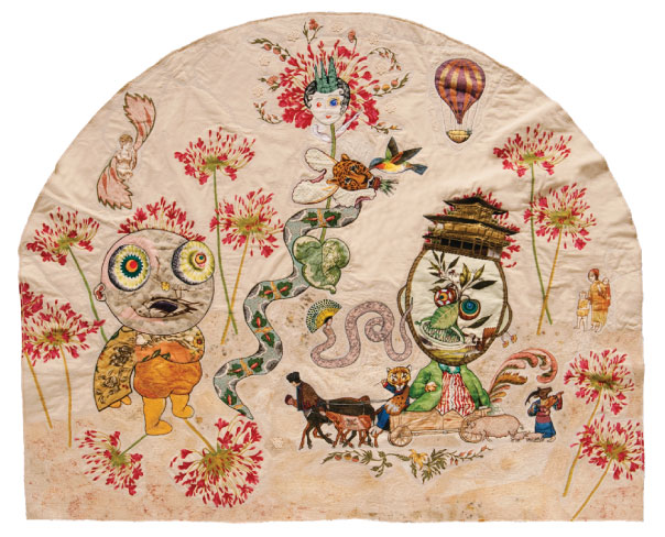
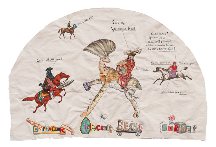
Glorianna was the first of only three drawings that I have made (at least so far) in a lunette or half-moon shape. In this first instance, it happened because it was the only way to stop the flowered pattern from taking over completely. I did some patching-over, too, with imagery when I could. I called the drawing “Glorianna” after the center female figure wearing the three-spiked green crown and the aureole of flowers, because she seemed to be the ruler of this land. In a time of unexplained crisis, when she called for a champion to set things right, a one-armed peasant boy with a dead bird for a mouth answered her call. What happened after that, I cannot say, because this drawing only shows the boy, almost against his will, answering her call, as a winged figure above his head signals his assent. Everything else in the drawing is atmosphere, the serpent and bird attending Glorianna, a second serpent floating nearby, whose headress echoes the shape of the drawing, the big-headed, temple-topped fellow in the wagon, his driver, musician, his pigs and beasts of burden, and the little family peering fearfully from the underbrush. Nonetheless, they are essential to provide a sense of place, and they really seem to belong there. The people, the flowers, and patched-in pieces of mottled silk fabric a little darker than the canvas combine to make a subtle landscape, with a balloon hanging in the distant sky. Their land seems innocent and isolated, the people credulous and brave.
I still remember what a hard drawing this was to make, how many technical and formal problems I had to overcome.
|
|||||||
|
Glorianna, 2010
|
|||||||||
|
|||||||||
|
|
I made The Language of Flowers in 2012, when I had already been using text in my drawings for almost two years, by appropriating words and letters from printed fabric. I began with a vintage silk scarf from a funky riverfront antiquities mart I visited on one of my rare visits to Kansas City, fused to canvas for body, altering its dimensions in the midst of my work on the drawing, which meant cutting off an inch or two from the bottom of the scarf and reconstructing the border around it. But I kept as many of the flowers as possible, for their surpassing loveliness and eloquence.
|
|||||||
|
The Language of Flowers, 2012
|
|||||||||
|
|||||||||
|
|
Whose Woods Are These? was the first drawing I made using my Consew industrial zig-zag sewing machine, much more powerful than the home portable I struggled with for more than a year because it couldn’t handle my increasingly ambitious attempts to draw with a machine. But the Consew could—it was like riding a great horse with an effortless stride—and thirteen years later, it still does. When I finished that first drawing and it didn’t look like anything I’d ever made before, nothing could have pleased me more. I was reinventing myself as an artist, a task I had set myself in the summer of 2000, when I suddenly realized that I’d been repeating myself for thirty years and believed I would die if I didn’t try to do something about it. I titled the drawing Whose Woods Are These?, after the poem by Robert Frost, because the manufacturer printed his name all over the camouflage fabric to discourage competitors from copying his design, and that made me think about who owned what. I had transformed the trees printed on the fabric into a drawing. Did that make them mine? Or did they belong to the tattooed city kid I had drawn standing gobsmacked in the midst of them? But what if someone or some institution bought that drawing? Would the new owner own those woods along with my drawing? Who can ever really own the forests, anyway? We seem to chop trees down or not, willynilly, as we please. Years ago I read a science fiction story about a special device connected to earphones that you could wear to hear the sounds that plants make: their sighs, murmurs and sussurations, the tiny shrieks of daisies being picked, the deep shuddering groan of a tree with every stroke of the axe. It drove the inventor mad, but I don’t think it would bother us. Masters of the Universe, we do what we like as much as we can and seldom worry about the consequences. End of sermon, back to the drawing. Whose Woods Are These? remains important to me because it was the first of what has become a substantial, still ongoing body of work. Other people respond to this drawing for various personal, symbolic, philosophical, and art historical reasons of their own. I am always surprised by how much people like it. Whose Woods Are These? was part of the first solo museum exhibition of my sewn drawings, at the Marianna Kistler Beach Museum at Kansas State University in Manhattan, KS, in 2007 and can be seen through November 14, 2015, as part of China Marks: Nowhere, Everywhere, a 60-drawing survey of my work at the Thompson Gallery, The Cambridge School of Weston, in Weston, MA. |
|||||||
|
Whose Woods Are These?, 2002
|
|||||||||
|
|||||||||
|
|
In clear violation of the rules of this game, I myself cast all the votes needed to make Sez Now the Drawing of the Month for October, 2015. It is one of my recent favorites, and it was not included in the big survey of my work—60 drawings, from 2002 to the present—up right now at the Thompson Gallery at the Cambridge School of Weston in Weston, MA, and running through the middle of November. (click for press release) The curator loved it, but there just wasn’t room. This is another way to make it seen.
|
|||||||
|
Sez Now, 2015
|
|||||||||
|
|||||||||
|
|
A Passing Glance is one of my Short Subjects, small drawings on white or off-white grounds, which I make by collaging and sewing into my computerized embroidery machine’s sewn approximations of old line drawings, mostly mine. I’ve made over twenty of them since I first began the series in the fall of 2013. What interested me about this one as I worked on it—simultanously the creator and its first audience—was how to suggest something that couldn’t be seen and make that the heart of the drawing.
The figure of girl in the foreground is remarkably eccentric, her Norman Rockwell head with a button nose and blue bead eyes atop a china pot body, but still oddly wholesome, even attractive. By making her loom up like that, she’s the first thing we see and stretches the implied space of the drawing. The bristly-haired fellow glancing her way consists of an heavily edited version of a 30-year-old line drawing of mine, ridden by a cowboy who just wants to get where he’s going.
Romance at a remove, but romance nonetheless. |
|||||||
|
A Passing Glance, 2013
|
|||||||||
|
|||||||||
|
|
I’d never made anything like “Patty and Bird.” I think it was a result of my having just finished “The Patchwork Pug Rides Again,“ an ambitious drawing based on a Renaissance painting. After that, I needed to cut loose, I guess…
|
|||||||
|
The New Singing Sensations, Patty and Bird! 2014.
|
|||||||||
|
|||||||||
|
|
In late March of 2013, the Pollock-Krasner Foundation funded my purchase of a computerized embroidery machine and CAD software, not in order to replace my two industrial sewing machines, which do all the sewing-down and sewing-into, but to make it possible for me to embroider whole sentences of dialogue instead of cutting out each letter from whatever text I could find on fabric and sewing it down, one letter after another, to cobble together words and sentences.
|
|||||||
|
Better Living Through Chemistry 2013
|
|||||||||
|
|||||||||
|
|
This drawing wasn't planned; they never are. I just start, and over time, it turns into something. I am always surprised by and grateful for the finished drawing.
|
|||||||
|
The Shape of Things to Come, 2014.
|
|||||||||
|
|||||||||
|
|
Gone! is such an awkward, odd, melancholy drawing that I am little surprised that anyone wants to know more about it. It would be better if you could actually see the drawing itself, which is three and a half feet wide and full of visual pay-offs, not just an online image of it, but that's true of all my drawings. In person, my drawings have real presence; they are objects as well as images; and whatever size they are is the size they are meant to be.
|
|||||||
|
Gone! 2014
|
|||||||||
|
|||||||||
|
|
Found was a tough drawing to make, demanding in the extreme. it is strange to look at it now, serenely inevitably itself, as if it was always like that. I still remember suffering over its formal and thematic complications. I bought the richly ornamented ground fabric at Boca Bargoons, a discount designer fabrics store in Hallandale, FL, on one of my annual visits to my ancient Uncle Mannie in Delray Beach. Its detail and symmetry made it a challenge to subvert. But I found ways to edit and alter the fabric, to transform birds into catbirds, to turn the lower medallion into a pond, to open up the space, then to construct characters to live in it for whatever time they had left, poor doomed Dave and Stan, their friends and dependents, a commentator, a little band of musicians, and various manifestations of Death.
|
|||||||
|
Found, 2013
|
|||||||||
|
|||||||||
|
|
It was unseasonably hot in June of 2005, when I chose an oversized toile print, acquired two years before at Joe's Fabric Warehouse on Orchard St., of figures ring-dancing, a musician at one side, with shrubs and trees in the background. As I sewed fabric scraps onto it—in my carefree this-to-that style of ten years ago—the figures came to life, a galumphing cow-man, a dusky crone in a gaudy gown, a rose-headed maiden with one claw-foot, a lithe cat-headed fellow, a little boy with an extra set of legs growing from his chest, a smiling wolf-man, flirting with a butterfly, and a blond goddess looking across at her seated husband who sprouts flowers and otherwise morphs as their child plays at his feet.
|
|||||||
|
My Summer in Japan, 2005
|
|||||||||
|
|||||||||
|
|
Time Traveler is one of more than a dozen Short Subjects I made in 2013, after having devised a means by which the CAD software that a 2013 Pollock-Krasner Foundation grant funded would convert old line drawings of mine into embroidery files and my computerized embroidery machine, also funded by Pollock-Krasner, would stitch them out using a running stitch, black thread on white or off-white fabric, to create a sewn version of the original drawing. Sometimes it produced a very rough approximation indeed, but it didn't matter, because one way or another, I would collage into it and patch over whatever got in the way. Then I would write dialogue for the new dynamic, which the embroidery machine also stitched out and I sewed down. This resulted in a still on-going series of small, spare drawings on light backgrounds, called Short Subjects, after the cartoons and news that used to be shown before the main feature at the movies when I was a kid.
|
|||||||
|
Time Traveler, 2013
|
|||||||||
|
|||||||||

|
|
Dreamwork is one of many broadsides I made in 2013, in the first full flush of suddenly being able to write legibly in thread, thanks to CAD software and a computerized embroidery machine funded by a Pollock-Krasner Foundation grant. I needed the new machine and software to generate text for my sewn drawings, but once I had the new equipment, it turned out that I had a lot more to say. And so I began making text-based pieces as well. Because they resemble single-sheet broadsides dating back to the invention of the printing press, I call them broadsides, too.
|
|||||||
|
Dreamwork, 2013
|
|||||||||
|
|||||||||
|
|
The drawing for the month of December is actually a sewn broadside; that is, part of a recent series of mostly small pieces where text rules, sometimes to the complete exclusion of imagery. If there is imagery, it is subordinate, though still essential or it wouldn't be there. In the rest of my work, I construct figures first which over time tell me what to write in the way of dialogue or commentary. With broadsides, words come first and are as demanding as my imagery. Even if a compelling line or two wakes me up in the middle of the night, it usually requires days of refining. I have notebooks full of early versions of broadsides as well as ones that never made the grade.
|
|||||||
|
What Beast, 2014
|
|||||||||
|
|||||||||
|
|
I don't think I've ever made a drawing as odd as Fighting Words. It is a profoundly eccentric drawing, even for me. Once I began embroidering text in the spring of 2013, instead appropriating it from printed fabric, my drawings became more lucid--except for Fighting Words, where I used my newfound ability to generate legible text to provide everyone in the drawing with something to say. For the fighters, I constructed two of the most outlandish, arbitrarily assembled figures of my life, whose ramshackle appearance inspired the fancifully illustrated riffs I wrote for them. I set them on a madly textured island amid a sea of stars, in front of a motley audience that wanted blood but had to settle for trash talk. The informality and too-muchness of Fighting Words reminds me of Reality Television, which is mostly awful, but still somehow compelling.
|
|||||||
|
Fighting Words, 2013
|
|||||||||
|
|||||||||
|
|
The Gallerist was the last drawing of mine to incorporate text appropriated from printed fabric before a Pollock-Krasner Foundation grant funded my purchase of a computerized embroidery machine and CAD software that enabled me to generate embroidered text and somehow also changed everything else over the next few months. But when I started work on The Gallerist, none of that had happened yet. For the ground I used a ferociously flowered fabric I'd found at a store in downtown Miami that as the drawing progressed, began to feel somewhat oppressive. I had patched over almost half the roses by the time the drawing was finished. But the remaining roses are essential.
|
|||||||
|
The Gallerist, 2013
|
|||||||||
|
|||||||||
|
|
I'm not sure that I had any idea what I was doing when I made Fruit Salad. I remember being quite determined to get the wall and the rug to co-exist, which along with the demands of the larger composition, required me to remake the wall in places. I labored over the figures, most especially the central figure, the Food Nazi, particularly his head, except for his topknot, which just happened. I sewed intensively to highlight the grapes and the pears he holds because they were backlighted in the fabric print I cut them from. The seated figure took a lot of work to get right; he didn't originally have a striped hide or a left arm, his nose came on the third try, his tongue, originally a flower petal, fell into place at the last minute, even though it was essential, likewise the fork. I only sewed into the blue of the sky visible through the window to mute the intensity of the blue.
|
|||||||
|
Fruit Salad, 2013
|
|||||||||
|
|||||||||
|
|
Who's She, Sushi? is an early drawing of mine that still more than holds its own. It depicts two remarkably vivid characters. Squinting against the implied light glinting off the choppy sea of the ground fabric, a pirate contemplates his captive. He is all excess, while if she consisted of anything less, she wouldn't signify, yet she does. Despite consisting largely of gold lace and colorful fabrics, the outlaw projects a dark and forceful intention: I will do as I please and it won't be pretty!!! Even so, the woman defies him. You don't need to worry about what happens next: she is caught in this moment for eternity, linked to her captor, the two of them as fixed and inevitable as a folk sculpture carved from wood and painted in great detail.
|
|||||||
|
Who’s She, Sushi?, 2003
|
|||||||||
|
|||||||||
|
|
This drawing was jumpstarted by my great need to transform the image of a sailing ship (from a reproduction of a 19th century painting coarsely silk-screened onto a piece of fabric I bought on West 39th St.) into a more or less human head, connect that head to a body, and to construct some sort of larger context for it, I don't know why. My first attempt, making a sort of Wind God out of it, was much too static, so I tore it apart, radically revised the head, discarded most of the body, and replaced it with something better. I anchored the newly made sailor, wearing dirty underpants and still in need of considerable revision, in a lively ground printed off-register and turned upside-down. I made the sailor's right leg and left hand from the couched gold threads of a fragment of an old Chinese embroidery, as if in acknowledgement of his many trips to the Orient. The flag fluttering on the mast of his ship-head reads: The Drowning Man.
|
|||||||
|
A Foreign Affair, 2013
|
|||||||||
|
|||||||||
|
|
Easy is weird and enigmatic, not easy at all, or at least that was what I thought from the way most people reacted to it. I've always loved this drawing. It started with an old flour sack that my mother sent me thirty years ago, which I'd used to upholster an old chair I found in the street when I still lived in Hoboken and made sculpture. Two years ago realizing that the flour sack with its quaint imagery represented raw material for a drawing, I removed it from the chair, cut it up, and got going.
|
|||||||
|
Easy, 2012
|
|||||||||
|
|||||||||
|
|
On May 17, 2002, in my journal for that year, in the middle of all kinds of other news, I wrote that "I somehow managed to begin composing a new big head," which then consumed me for days, until I got it right. The ground fabric was a cliff-hanger, the last bit of a flowered fleece that I'd bought the year before at a Fabric City store in New Jersey my friend Valeri Larko brought me to. When I set the head against that little scrap of printed fleece, I was amazed and gratified to see how its fuzzy daisies made Acid Dandy's head snap into focus. Speaking of daisies, earlier that year my Aunt Daisy died at 95 and left me her scraps of handmade lace, the most flamboyant of which I assembled into the Dandy's nose. I wish that my Aunt Daisy could have seen the finished drawing! The machined lace for the Dandy's collar, neck, earring, and hat pin came from a stash of cuts originally intended for Victoria's Secret. A dozen years later, I'm still finding uses for them.
|
|||||||
|
Acid Dandy, 2002
|
|||||||||
|
|||||||||
|
|
I usually buy fabric for future drawings without knowing how I will use it, simply because it attracts me. Friends and acquaintances also contribute pieces of fabric, though not always what I need. But in the spring of 2012, when a friend showed up with a tea towel of Irish linen displaying a colorful print of birds at a bird feeder, I knew immediately I wanted to transform the bird feeder into a head. And some months later, that was how this drawing started. I spent a lot of time on the birds, variously enriching their feathers with thread or beads, giving two of them goggle eyes, having them converse in Japanese. Once the head began to take shape, the linen fraying at every opportunity, I worked hard to construct a figure that would support it, setting whole thing into a chinoiserie landscape, of which I had just enough fabric to patch out everything I didn't want. Half-through, I ran out of an essential light green thread for the landscape and when I couldn't find any more, had to eye-mix two other colors of thread.
|
|||||||
|
The Pitch, 2012
|
|||||||||
|
|||||||||
|
|
At the Zoo is one of a series of sewn broadsides that I made last year after I used a grant from the Pollock-Krasner Foundation to buy a computerized embroidery machine and CAD software in order to stitch out text in various typefaces. I intended the embroidery machine to provide text for my drawings, which it did in spectacular fashion, but with a new machine and software available, I found that I had more to say. Waking up at 3 in the morning with lines in my head, writing in a notebook on the subway, revising verses as I swam laps at the Y, I began creating works of written art entirely independent of my drawings. I called them text pieces until Alex Campos, Director of the Center for Book Arts, told me that they were broadsides, direct descendants of single sheets of paper printed with text, sometimes together with images, beginning with the invention of movable type. Some verses came easily, others required endless revision. At the Zoo only started to make sense after I found an image of a horned beast among stash of silk-screens on fabric I had printed speculatively fifteen or twenty years ago. I changed the verse to make it fit. There was enough fabric left unprinted to accommodate the embroidery. The image is derived from an etching I made in 1967, when I was a sophomore at the Kansas City Art Institute. The paint-stained fabric framing the beast comes from an old pair of my work pants. I suppose that makes it even more autobiographical. I certainly am tense and intense. Anyway, all kinds of old and new things came together, but not until my new embroidery machine made it possible. |
|||||||
|
At the Zoo, 2013
|
|||||||||
|
|
Although I didn't realize its significance until I had almost finished it, Above and Below, 2010, was a tremendously important drawing for me. Sometime before, I'd bought a yard of fabric printed with a mid-20th Century comic strip promoting home sewing and had already appropriated bits of imagery and text from it for my drawings. But one particular conversation between two dolled-up women was so wonderfully silly that in late summer of 2010, I decided to make a drawing for the express purpose of using it. The drawing that resulted was Above and Below.
|
|||||||
|
Above and Below, 2010
|
|||||||||
|
|||||||||
|
|
I made the First Back Book in the summer of 2009, a month or two after
|
|||||||
|
Second Black Book, pp 4-5, 2009
|
|||||||||
|
|||||||||
|
|
I was afraid for my country when I made this drawing. G. W. Bush was in his second term as president, waging an ill-advised, ever-widening war and calling anyone who disagreed with his policies unpatriotic. The conservative propaganda machine was out in full force, demonizing what had previously been regarded as the loyal opposition. Though I don't usually make political art, Dangerous Noise became a political cartoon.
|
|||||||
|
Dangerous Noise, 2007
|
|||||||||
|
|||||||||
|
|
I spent weeks on this drawing and it is full of good things. But what I didn't realize until months afterwards is that Girl God at 15 was a transitional drawing, with at least two different approaches to text, constructed and appropriated, that didn't work well together, at least as used here. Ambitious as ever, I used the imagery and the text—or they used me—to construct an half-silly, half-sad drama about a living goddess, sheltered and cosseted, who moves from happy, compliant childhood into full adolescent rebellion. Wearing ceremonial dress except for her ritual boots festooned with bells, which would have alerted her keepers, she's running away from home in slow motion, since she has nowhere in particular to escape to. She insults and defies her nurse, a devoted and long-suffering mother-equivalent, because there will be no serious conquences. And before she goes far enough to get into trouble, Errick will scoop her up and take her home.
|
|||||||
|
Girl God at 15, 2011
|
|||||||||
|
|||||||||
|
|
Almost soon as I roughed out the figures for this drawing, I recognized them as old friends of mine, a married couple, Greta and Peter, not as they were, but as they might become if they grew old together on a somewhat fanciful farm. In my journal for that year (2005: A Stitch in Time), I wrote: In the new drawing..., the space has collapsed and Greta, Peter, the animals, the flowers, and the hills are crammed together cheek-by-jowl, which is such a kick! It's funky and anarchic and fake folky. I started out calling it When Greta and Peter Grow Old. Pretty much from the beginning I knew how wonderfully weirdly hallucinatory the patched-together farm was, but I didn't realize that the tiger at one edge of the drawing was death until some time this afternoon....It's an ecstatic vision—my first." The text I appropriated for Greta, "Hello, who's there?", gave the drawing its final title, and was especially fitting, when Hello! was chosen for its charm and relatively small size as the image for the cover of the catalogue for Let Me Show You the World, the first solo museum exhibition of my sewn drawings at the Marianna Kistler Beach Museum of Art at Kansas State University in Manhattan, KS, in 2007. The drawing's vivid verso, or backside was reproduced on the catalogue's back cover. There are still a lot of farms in Kansas, but none like the one in Hello! |
|||||||
|
Hello!, 2005
|
|||||||||
|
|||||||||
|
|
About half-way through my four months of work on Serving the Process, my 2012 book, I roughed this drawing out, from the same selection of prepared fabric scraps that I used for the book, but when I saw that it didn't belong in the book, I put it aside. After I finished the book, I looked at the drawing again and despaired. The figures were so outlandish that I would have to spend a lot of time making sense of them. There were too many tiny letters to be sewn down, reconstructed, and integrated. And it was on a ragged, irregularly shaped piece of canvas but needed more.
|
|||||||
|
About the Book, 2012
|
|||||||||
|
|||||||||
|
|
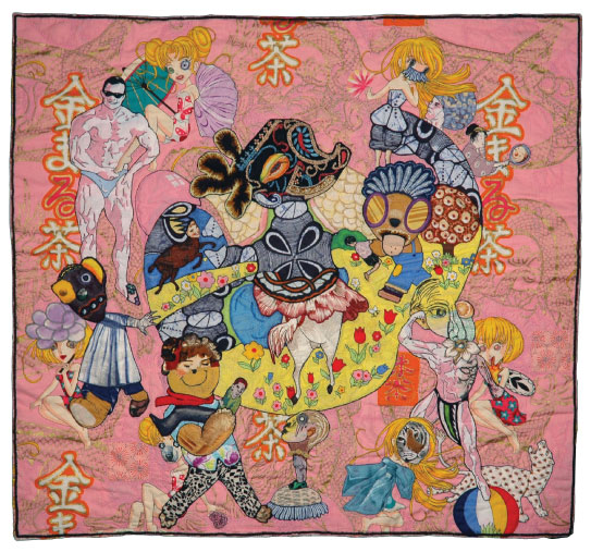
In the fall of 2005, my journal was filled with news of my work on the big drawing that eventually turned into Drink Me! Beginning as a relatively straightforward portrait of the goddess Kali, carrying a basket of body parts, over several weeks, the drawing was radically revised several times, figure and ground alike, growing in size, ambition and strangeness. The original yellow ground with flowers was reduced and amended to flow around and through what had become a decidedly masculine Dark God. It was now embedded in a pink fabric printed with gold dragons, supercute anime-style girls, and Japanese advertisements for tea, which suggested the title. I did a lot of work on the girls, who acquired partners, some odder than others. I edited the pink fabric so drastically that I had to reconstruct most of the background dragon motif in gold. I still remember having to match the pink and the seemingly interminable sewing of gold thread! The payoff was that by the time I finished Drink Me!, I was working at a new level.
|
|||||||
|
Drink Me!, 2005
|
|||||||||
|
|||||||||
|
|
|
Girl God at 15 is one of those awkward, perhaps not entirely successful drawings that belong in my portfolio of drawings because 1), it represents my first attempt to set up a conversation among characters; and 2), it uses altered display type and invented letters to name the characters, and I haven't used them since. Girl God at 15 is a transitional drawing that both signifies and suffers for that. Nonetheless, I still find the scenario, at least as I read it—meaning is always up for grabs in my art—compelling. Embodied as a rebellious 15-yeard-old girl, a living god turns violently and profanely against her devoted nurse and all the strictures of her exalted status. Astride her three-legged beast, in full ceremonial regalia except for her shoes, she is running away from home, but in slow motion, because she doesn't have any idea of where to go. She is about to be captured and led back to her quarters. I still remember what a stubborn, sullen 15-year-old I was and how much grief I gave my mother. Intellectually ambitious, in sensory overload, and awash in hormones, I did the best I could in the profoundly alien culture of Kansas City, Missouri. So did my Mom. I'm glad she lived long enough for me to begin to make it up to her. I identify with everyone in this drawing and wish them all luck! |
|||||||
|
Girl God at 15, 2011
|
|||||||||
|
|||||||||
|
|
Though I made this drawing in 2003, I still remember sweating over it, trying to pull it together, and no wonder! It has no business working at all, and yet it does, at least to the point that ten years later, visitors to my website have just voted it the Drawing of the Month. I titled this drawing The Proxy because during the process of making it, I perceived the woman with a radiant right eye and a disproportionately large left arm as an agent or emanation of the dark head she stood upon, functioning to do his will in a white and alien world. A narrative suggested itself in which the head on the floor was that of an immensely powerful African healer who was healing a sick king from thousands of miles away. Either as a victim of a malicious spell or as a result of past deeds, the king had turned into a lethargic and ill-tempered serpent. The drawing shows a proxy thrusting a serpent-killing antidote down the king's sorry throat, followed by a restorative tablet from an associated spirit. Healing by proxy across a great distance took such effort that medicine man could sustain it for a only short time, hence his urging, "Quick!" On the other hand, as always with my drawings, this drawing is open to other interpretations. These days, I don't construct figures in such a nakedly this-to-that fashion, even when I want to draw attention to their assembly. It's a little hard for me to look the figuration at this drawing when I can do it so much better now. It hasn't become any easier, it is just a different kind of hard. But I still like the proxy's powerful green left arm and the upper torso and head of the king. |
|||||||
|
The Proxy, 2003
|
|||||||||
|
|||||||||
|
|
In 2003, I found a toile at Joe's Fabric warehouse on the Lower East Side that was unlike anything I'd seen before, except in color. The clarity of the print was remarkable and the figures were three or four times the usual size of figures in toile fabrics. And the figures were such an odd mixture of artifice and the historical record that they possessed a strange authority. I was told that the fabric had been silk-screened by hand in France. Smitten, I bought a yard of it for $25. As usual, I had no plans for it, I almost never do. For this drawing, I imported the horse, the wagon, and its passengers from that toile without changing them at all, except as needed to integrate them with the ground. I bought the ground fabric at a fabric store on on Fulton Street in 2003. I radically altered it for use in this drawing, moving rockets and chunks of space dust and vapor to support and frame the people in and around the wagon and the horse pulling them, who remain utterly oblivious of the change in scenery. I applied white lace flowers to the figures for formal reasons, but in the context of the drawing, they aren't flowers, but representations of mathematical artifacts of the disruption of the space-time continuum that just happen to resemble flowers. As is probably already obvious, I make things up as I go along and this drawing was no different. The proportions of the wagon group decided the proportions of the drawing, almost panoramic in feeling, reminiscent of 19th century history paintings. Only now these visitors from the 18th century were marooned in cold, airless, infinite space with its own unimaginable timeline, resulting in the end of history as we know it, hence the title. |
|||||||
|
The End of History, 2003
27.5” x 46” fabric, lace, thread, fusible adhesive |
|||||||||
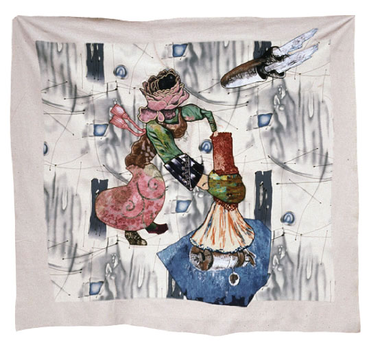
|
|
In August and September of 2002, I worked very hard on Space Witch, doing and undoing, and at a crucial point, having to resolve a serious sewing machine jam-up. Because I had only been drawing with an industrial zig-zag sewing machine for a few months, I occasionally got myself into mechanical trouble out of sheer ignorance, but with a headlong passion for the medium, I forged ahead anyway.
|
|||||||
|
Space Witch, 2002
47” x 51” fabric, lace, thread, silk-screen ink, acrylic & latex paint, fusible adhesive |
|||||||||
|
|
|
As is usually the case, I began Beach Head without having any idea of what it would eventually look like. All I cared about was making a big, eccentric head. When I had taken the head as far as possible, at least for the time being, and looked through my boxes for a ground fabric to surround and support it, I chose something with finely detailed scenes of mothers and children at the seashore in Edwardian England, because it had a lot of red in it, and the big head was mostly red... When I sewed the head into the center of the ground fabric, it felt simultaneously immensely benign and profoundly destabilizing. In turn, the ground fabric destabilized the head, which required a whole series of further revisions to earn its anchorage at mid-drawing. Some people read the head backwards, as a fish, or forwards as the flayed skull of an ox or as a giant bloody heart. For me, it remains a vastly powerful head with a rainbow smile, around which the entire drawing revolves.
|
|||||||
|
Beach Head, 2011
45" x 54" fabric, thread, silk-screen-ink, fusible adhesive, Beva |
|||||||||
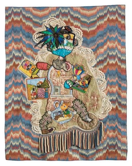
|
|
It's been almost five years since I made Billy Van. By now my drawings have changed so much that it feels much older, almost like an artifact of a lost America, where a sequined abstract flower cut from my dead Aunt Glenna's sweater forms one eye of an addled, buck-toothed, manic hustler of tales, a holy fool, lace-haloed, a flamboyant entertainer, composed of pictures of all kinds, barnstorming through the Middle-West. As I remember the making of it, the subsidiary images were fractious even then, breaking out of character, invading other scenes, dreaming of murder... But Billy Van, half-drunk or maybe just stoned on his dreams, kept moving on, from town to town. Always behind him, the red, white, and blue zap and flicker of America's brain waves, a strange mock bargello I found in the backroom of a discount fabric store on west 39th St years before. |
|||||||
|
Billy Van, the Illustrated Man, 2008
48” x 38” fabric, lace, thread, silk-screen ink, fusible adhesive |
|||||||||
|
|
|||||||||
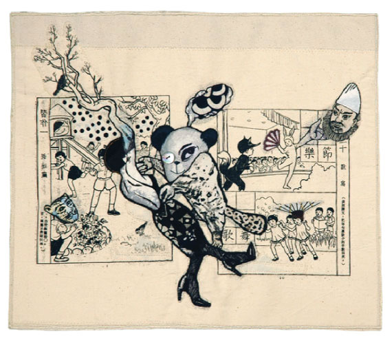
|
|
One of the best things about having committed myself many years ago to process-directed art making is the role that chance plays in my work. In 2004 or 2005, on one of my regular food shopping expeditions to Chinatown, I found a new child's coloring book on the sidewalk and took it home. I eventually made silkscreens of a few pages and speculatively printed them on muslin, thinking that I might harvest parts for one kind of hybrid figure or another. But after I made an early version of a cheerfully anarchic little bear roughing up a noiresque Daphne and then began looking for a ground to anchor the unhappy couple, I ended up using one of the prints I'd made of two pages from the coloring book. This drawing is called "The Beast in Me" because of course I could not help identifying with the way the bear was knocking around Miss Hot, even though I do not like or practice violence of any kind except against fruits and vegetables and an occasional can of sardines. The drawing also includes a beast-faced little girl, crouching at the lower left, watching the action—for all I know, possibly imagining it, as her little friends play more innocent games, oblivious to her dark fantasies. At top right, an adult face, that of a god or a sage, derived from imagery on joss paper, is also watching, with apparent approval. |
|||||||
|
The Beast in Me, 2006
13.75” x 16” fabric, thread, silk-screen ink, mother-of-pearl button, fusible adhesive |
|||||||||
|
|
In the fall of 2003, I bought a yard of cloth printed with colorful race cars. It had an old-fashioned feel, like something that might have been sewn into curtains for a boy's room in the forties or fifties. As much as I liked it, I couldn't figure out how to use it until early one morning in December when I sat bolt upright in bed and said to myself, "My heart could race!" And that's how I started, finding among the figures on a fabric showing basketball players a fellow with a strong right arm to carry my heart. In the other cars I put a miscellany of drivers: a deer, geisha, tiger, bird, and cat, which when I look at the drawing now, eight years later, somehow remind me the various creatures paddling about in the sea that Alice made with her own vexed tears before she finally figured out how to shrink down and ended up in the sea herself.
|
|||||||
|
My Racing Heart, 2004
27.75” x 28” fabric, lace, thread, silk-screen ink, acrylic paint, fusible adhesive |
|||||||||
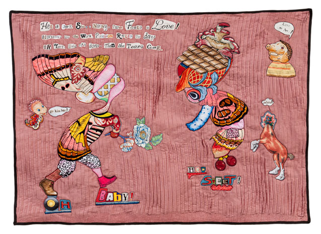
|
|
It had been a while since I'd made a drawing with lovers in it, so I wasn't entirely surprised to encounter these two besotted creatures making eyes at each other. I was going to draw any entire room around them, but they wanted something more intimate. I ended up using a pinky-brown synthetic with permanent mini-pleats that somehow reminded me of human insides. The fabric pilled and sprawled, a real challenge until I figured out that the secret was mostly not to manage it.
|
|||||||
|
Love Will Find a Way, 2011
38" x 53" fabric, thread, silk-screen ink, fusible adhesive |
|||||||||
|
|
In the spring of 2003, in a store on Queens Boulevard, I found a bolt of fabric with a pattern seemingly derived from a Japanese scroll painting, with large wave-like forms that made me think of the ocean. As soon as I saw the fabric, I wanted to buy it and build a boat to float in it. And so I did. The boat, constructed of a micro-pleated black synthetic and lined with a dark green patterned silk, came fairly easily. But the sailors I made for the boat looked all wrong, stiff and stupid, so I took them apart and put the pieces away.
|
|||||||
|
The Sea Fairy, 2003
|
|||||||||
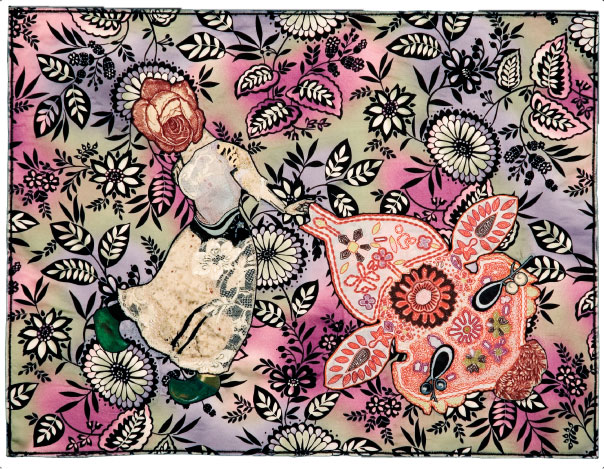
|
|
I've been making oblique, some would say metaphorical, self-portraits for years. I think that my 2007 Portrait of the Artist is one of the nicer ones because it's so playful, in contrast to one of my drawings from 1990, titled Portrait of the Artist as a Moral Idiot.
In 2007, as usual, pretty much without meaning to, just because the process took me in that direction, I depicted myself as a goofy, femmy, knock-kneed goddess in green shoes—love those shoes!—emerging flower-faced from a floral landscape to send one of her drawings out into the world. The drawing she launches looks almost as if it had been put together from elements of the landscape, but in a profoundly transformative way so that it now resembles a fat, alien, winged insect, dense with markings and/or information, simultaneously seductive and scary. I do think that by the time I finish a drawing, it is breathing on its own and contains things I could not possibly have imagined or known. In fact, as much as I like it, I can scarcely recognize this Portrait as something that I made. And like all my art, it will eventually have to make its way in the world without me. |
|||||||
|
Portrait of the Artist, 2007
|
|||||||||
|
|
Within a day or two of beginning work on The Queen of Denial in early November of 2010, I realized that without any conscious direction on my part, my longtime process of speculative art-making had produced a template for a series of drawings in which stylized hybrid figures would occupy and help to define some kind of description of space, in relationship with text that I wrote myself. I'd been making one-offs for years and never imagined doing anything else. After I was seized by the idea of creating a series, I worked very hard to make The Queen of Denial as well and as quickly as I could, so that I could start the next drawing in the new series, finish that one, begin another, and so forth. As of August, 2012, there are now eleven drawings in the series, with more to come. But The Queen of Denial is the sublimely silly drawing that started it all. It still makes me smile. On a narrow stage-like strip of ground against the backdrop of a vivid sky, two friends enact a ritual exchange; you did, I didn't! but of course he did (he always does and says he didn't!).... The text came in pieces and was revised as I went along, which is my usual practice with imagery. To construct the words, I cut up display type I found printed on fabric and also made letters from scraps of variously patterned fabric, just as I had in my book, Pressing Questions, from the summer of 2010. I soon discovered other sources of printed words on fabric, but at the end of 2010, when this series was just beginning, I used what I had, and that was more than enough. |
|||||||
|
The Queen of Denial, 2010
|
|||||||||
|
|
I finished Radiant Messenger in the fall of 2007. Radiant Messenger was never a popular favorite like The Sea Fairy. But I've always loved that nutty, fractured three-ring circus of a drawing, and even though I am now concerned with other things, so that my current work looks considerably different, I still love it. Why? Why does anybody love anything? But here are some things that occur to me. The drawing has a high, anarchic energy level. It plays with reds and blues and shows its seams, repeats shapes and motifs in an almost musical way, and favors brown over black. In its embrace of freakdom and its confidence in the splintered arc of its narrative, Radiant Messenger demonstrates a curious kind of innocence, its characters seeming to inhabit a strange but ultimately benevolent world, apart from our own. I still remember how much work this drawing required, not just the usual interminable doing and undoing that comes with process-directed drawing, but endless sewing to control all the fraying edges—fraying white against dark brown, aaargh!—of the pieced-together floral ground and also of course sewing and more sewing to make the various persona practically inevitable. It was worth all the trouble. I am amazed and grateful that other people else like Radiant Messenger well enough to make it the Drawing of the Month for July 2012. |
|||||||
|
Radiant Messenger, 2007
|
|||||||||
|
|
I never wanted to make an altered book and probably never would have if I hadn't been asked by Anne LaPrade, director of Hampden Gallery, UMASS Amherst, to participate in A Novel Idea, a show of altered books, last December, in the Project Space of her gallery. With my passion for narrative, I resolved to turn one book into another, morphing the imagery and the storyline while keeping its book-ness intact. I bought Lobbyists, a photo-essay about Washington lobbyists by Neil Selkirk, for $5 at Strand Books. I removed about every other page to make room for what I was going to put in, scanned imagery from my book shelves, printed onto archival paper. I cut it out and fastened it down with Jade glue. I also collaged the front and back covers. After I repaginated the book and wrote a sweetly deadpan narrative, I used Word to fit my story into text boxes and conversation balloons. Once I cut those out and glued them in, Lobbyists had been transformed into Weirdsville, a somewhat grotesque graphic novel. I still prefer making my own books from scratch, and because my usual process and materials differ from the cutting and gluing of Weirdsville, my six sewn books look very different from this one. But using digital fonts instead of appropriated and self-made text got me thinking seriously about turning some of my longer stories into printed books. That I could write a forty-page narration was a revelation. Even if I never make another altered book, I am very happy to have made this one. |
|||||||
|
Page 3, Weirdsville, 2011
|
|||||||||
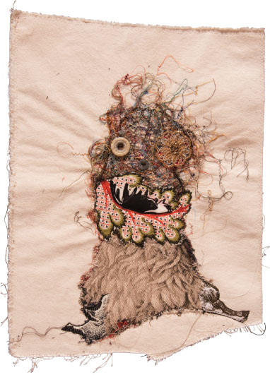
|
|
History and context. About fifteen years ago, at Christmastime, when I was still working on paper, I made a little holiday drawing as a gift for a mentor. There was something about the casual, occasional nature of my task in the midst of the commercial frenzy of our contemporary Christmas that engaged me. So I did it again the next year, with whatever materials I had in the studio, the year after that, and the next. I never even bothered to document those drawings. In 2002, after Luise Ross began to represent my work, I gave my little holiday drawings to her. I wasn't working on paper anymore, so they were sewn. Here are pictures of three of them:
Even though I stopped giving my holiday drawings to Luise in 2008, I continued to make them for my own pleasure, to be photographed and used as digital seasonal greetings to my friends. Anna, my 2011 Christmas drawing, is entirely digital, combining a scanned image from an advertisement with a verse that I wrote, very much of a piece with the drawings with text and imagery that I have been making since November of 2010. Hark! was my 2009 Christmas piece, unlike any of the others, before or since, originating with a snarl of threads sewn into a ragged piece of canvas left over from testing the stitching and alignment of my industrial sewing machine. As small as the drawing is, it possesses such an anarchic, elemental energy that it exists entirely on its own terms, whatever those might be. I made it, but I can't possibly explain it. |
|||||||
|
Hark!, 2009
|
|||||||||
|
|
I usually begin a drawing by assembling hybrid figures out of imagery appropriated from printed fabric. When the figures grow compelling, I look for something to use as a background. But sometimes, when I find fabric that already contains a strong narrative, I go the other direction and start from there, adding imagery to enrich and subvert the existing order. This was the case with Heavenly Creatures.
|
|||||||
|
Heavenly Creatures, 2009
|
|||||||||
|
|
Horses are the subject of "A Book of Horses," 2008—how we know them, culturally, historically, and psychically. More or less by accident, I had accumulated a store of various printed fabrics showing horses both harnessed and unencumbered. I used almost every scrap of a big secondhand scarf with a hunting print I bought at a funky weekend market in a field outside Kansas City, Missouri. And I used the image of a horse pulling a sleigh from a yard of toile-printed chiffon I bought on Lower Broadway. As soon as I saw it, I wanted to cut the horse free of the sleigh and set him into a starry night sky, but it took me a little while to get around to doing it. Once I did, I had a powerful image to put on the cover of "A Book of Horses". The picture of a horse running free in the night sky helped to determine the mood and direction of the book during the months of intensive work that followed. Two years before that, in the back room of a discount fabric store on West Thirty-ninth Street, I found a deeply discounted fake fur that had been tie-dyed and then overprinted with a snake-skin pattern. I just had to have some! But I could never figure out what to do with it until it occurred to me to use it for the cover of this book, where it looked oddly appropriate. As the book progressed, I also incorporated second-hand lace, yellowed and browned, wherever I could: as a flyleaf, for textural value, as a formal element. I wanted my narrative to reek of history. However labor-intensive, an eight-page book can scarcely encompass the vast subject of humankind's long relationship with horses. That's why I called it "A Book of Horses"; that is one of many, with more to come, but probably not written by me. Restless as ever, I have moved on.
click to view slideshow
|
|||||||
|
A Book of Horses, 2008
|
|||||||||
|
|
My hybrid imagery is always a little strange, but sometimes I like to make it pretty, too. That's Florabundum. Florabundum, made of flowers and with nothing else on its pretty mind, belongs on the wall of someone's home where it could summon summer in winter and give pleasure the year round. I finished Florabundum in September of 2006, at the end of summer, but summer never ended inside that drawing, with a head composed almost completely of flowers, stacked and massed and layered, set against a blue sky mottled with thin clouds. I didn't intend to construct a head out of flowers, but I'd recently bought a yard of an old-fashioned decorator fabric printed with wonderfully dimensional blossoms at Baltic Bazaar, a thrift shop on Atlantic Avenue, and before I knew it, I was on my way. The neck is the bottom of a flower vase from the same fabric. The upper torso was made from half of a huge red poppy on the back of a silk jacket belonging to my recently deceased Aunt Glenna. In its center, I placed an active beehive, the equivalent of a beating heart. I like to think that if you came close enough and listened very hard, you could hear the hum of the bees. The title, Florabundum, is a word I made up to conjure an abundance of flowers. The head in profile against the sky comes straight from the Italian Renaissance, but not this particular head, which is much too baroquely frou-frou to have come from sixteenth century. Like all my work, it is what it is, and that is enough.
|
|||||||
|
Florabundum, 2006
|
|||||||||
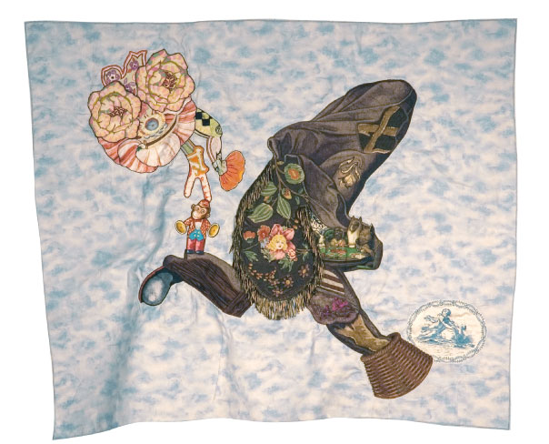
|
|
But what does it all exactly mean? I spend weeks and months making my drawings look inevitable. Whatever meaning they possess derives from this process, but it is the part I feel least responsibie for.
|
|||||||
|
Goodbye to All That, 2008
|
|||||||||
|
|
I depicted only a few of the people condemned to hell because I didn't want their agonies to become the focus of the drawing. Besides, hell is an enormous place, and there is always room in the Lake of Fire for new arrivals. Hell is exceedingly bright and burning, with a fierce hot wind. My drawing shows only a little bit of it. The Dark Being and his daemon are smiling because this is their kingdom and to their liking, despite all the suffering and crying out to God and the devil, perhaps even because of it. A Belgian collector now owns Bright Hell.
|
|||||||
|
Bright Hell, 2004
|
|||||||||
|
|
I may well have been influenced by reproductions I'd seen of allegorical heads from the Renaissance. The difference is of course, is that the allegory of the Renaissance was accessible to anyone who shared the culture of the artist, his patron, and his church. Whereas my imagery takes shape over weeks and months of process-directed work and its meaning is up for grabs. All I ever know for sure is when a book or drawing needs more work and when it's done.
The centerfold of Book of Lives was used for the cover of the 2010 issue of Jelly Bucket, an annual literary journal published by the MFA program in Creative Writing at Eastern Kentucky State University.
|
||||||||
|
The Book of Lives, 2008
|
|||||||||
|
|
A few weeks later, it occurred to me that there were silk-screens in my cellar from years ago with text on them, made for variety of purposes. And if I printed them with white ink on black fabric and then put them together with words cut from the umbrella fabric, I would have a store of words and letters that I could compose with, just as I composed imagery for my drawings from thousands of scraps of patterned fabric. And so I did. With all those words, I just had to make a book, especially since it had been almost a year since the last one. I didn't decide in advance not to have illustrations, but the text was so rich with imagery that the book didn't need them. And with no pictures, you could really see what else was going on. I wrote the text myself over about a week and a half. Since the book was so black, it made sense, at least to me, for it to be about the heart, which pumps away in the dark. People have asked if it is really about my heart or if that is poetic license. A little of both, I say.
|
|||||||
|
The First Black Book, 2009
14.5” x 19.75” open fabric, thread, sequins, industrial felt, silk-screen ink, Jade glue, polyester batting, fusible adhesive, Beva |
|||||||||
|
|
The story I told myself as I worked on it—this just my story, which changed as the drawing changed and/or I suddenly figured something out, and you're welcome to find another—was that Birdgirl was an adolescent, perched uncomfortably between a toy-like frog prince of childhood and a more grown-up but equally fantastic prince galloping towards her. Most adolescents feel like some kind of freak or another. I know I did. Harvey Hix, a terrific poet who always loved the first Bird Girl, owns this one. It seems like a very good drawing for a poet, since everything in it means at least two or three things at the same time.
|
|||||||
|
Birdgirl, 2005
29” x 22” fabric, lace, thread, silk-screen ink, goggle-eyes, Jade glue, fusible adhesive |
|||||||||
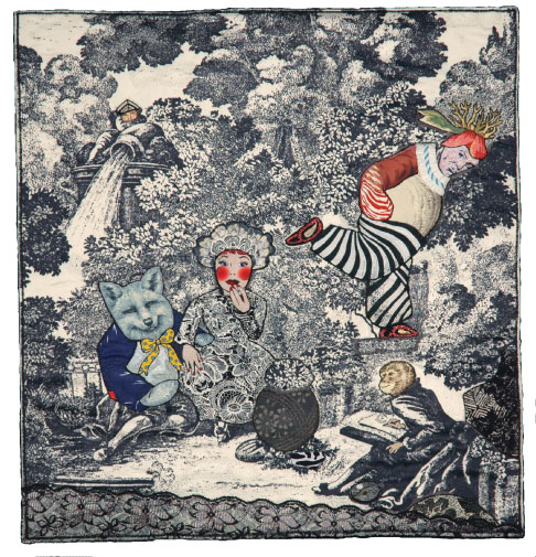
|
|
But the toile was black and white. And because this was her realm, I dressed the Queen of Hearts entirely in black, except for her face—or is it a mask? But I made the wolfman lover and the spurned lover sulking at one side as colorful as I could. This particular Queen of Hearts is powerful and capricious, more of a witch than a princess. I didn't plan that—it came out of process— but I don't mind. Making the artist into an ape was a little joke on myself and my artist friends. Otherwise, I remember working very hard to carve out space for my characters in all that black, re-routing paths and building outdoor furniture.... In 2008, I used the same toile in a different color for different purposes on pp. 6-7 of A Book of Horses, which can be seen here. |
|||||||
|
At Home with the Queen of Hearts, 2005
23” x 21.5” fabric, thread, silk-screen ink, fusible adhesive |
|||||||||
|
|
|||||||||
|
|
|
|||||||
|
Drive He Said, 2003
32” x 24” fabric, lace, thread, silk-screen ink, fusible adhesive |
|||||||||
|
|
|
|||||||
|
Death Takes a Holiday, 2007
34” x 34” fabric, lace, thread, fusible adhesive |
|||||||||
|
|
|
Hot and somewhat humid. I just finished Sushi. Parts of it changed a great deal in the making, especially the nose, mouth and jaw, and yesterday, towards the end, the addition of a sewn-down chunk of gold fringe at the back of the head to create a ponytail that immediately made the sailor more youthful and flamboyantly studly. I hadn't meant to, I just needed to do something that would make the head continue part of the way down the neck, but I didn't mind, it made me laugh. By then I could see that the drawing wouldn't need a ruffled edge or to be cut into an elliptical shape—there was already plenty going on. Today, after I finnicked all morning and most of the afternoon, I determined the dimensions, sewed them in my usual approximate manner, and cut off the excess. |
|||||||
|
Who’s She, Sushi?, 2003
29” x 29”, fabric, thread, lace, silkscreen-ink, metalic embroidery floss, fusible adhesive |
|||||||||
|
|
|
(March 2011 Drawing of the Month) Drink Me! is the Drawing of the Month for March, not because it got the most votes, but because Denise Duhamel recently wrote a terrific poem about Drink Me! and I wanted to everyone to see it.
THE YEAR OF THE MUSCLE MAN
Denise Duhamel
|
|||||||
|
Drink Me!, 2005,
31” x 34”
fabric, lace, thread, silk-screen ink, fusible webbing |
|||||||||
|
|
(February 2011 Drawing of the Month) Pressing Questions is my sixth book since 2007 and my third book to include text. I finished it in August of 2010. I started by composing the questions, which took a considerable time to write and revise. The questions fairly begged for illustrations, and I was happy to oblige. The only way to make sense of the double spreads was to work on the text and the illustrations at the same time. Because my art is process-directed and takes shape over time, things always happen that I don't expect. My biggest surprise was the appearance of display and fancy type, which was needed to make the text stand out against the ground fabric, a print of ivory fans threaded with colored ribbons. I found fancy type in fabric I already owned, a yard of this and that. Until last summer, I had never noticed that any of it had writing on it. At first I used the letters as they were, but soon began altering and ornamenting them freely. It was speculative play of a different kind for me, thrilling and a little scary at the same time... And when I couldn't find a big enough G or and a sufficiently expressive B, I constructed them out of the same elements I used to make my imagery. Over time, the pages of text, one for each question, became complex little worlds of interrelated words. In response I kept the illustrations as simple as possible, revising repeatedly to make every element count. |
|||||||
|
Pressing Questions, 2010
|
|||||||||
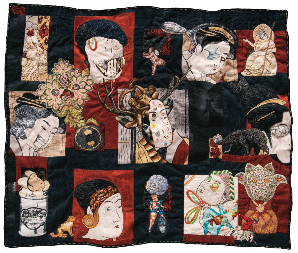
|
|
I found the fabric that is the basis of Private Mysteries at the Fabric Mill, Plainview, NY, in June of 2009. The pattern consisted of big, stylized portrait heads of geishas from the Floating World, probably originally collected in albums, but here set into colored panels, with Japanese motifs used as decorative elements. I remember being drawn to the abstracted hairdos, but had nothing in particular in mind for the fabric. I rarely do. As recounted in the description of my working methods (Process), I usually begin by constructing figures or parts of figures from scraps of patterned fabric. Then I look for a length of uncut fabric to act as background. But when I find a fabric like this one, with a robust narrative, implied or explicit, I start from there. I began work on Private Mysteries in October of 2009, and after weeks of intensive sewing-into, adding and taking off patterned scraps and other elements, doing and undoing, finished it in December of the same year. Though I can’t say exactly why, I regard it as an oblique self-portrait. I started with the simple notion of changing all seven geisha heads in different ways, a visual version of a musical theme and variations. But the changes turned out to be so extensive that almost every square inch of the fabric, both color and image, got into the act. I had to sew into and alter most of it in order for the drawing to make formal sense. You may not be able to see it here, but all that sewing enriched and varied the surface of the drawing. While I was in the middle of work on Private Mysteries, someone gave me a stash of wonderfully colorful buttons, all sizes and shapes. I used a good number of them, about 22 in all, not just as eyes and noses. Can you find them? |
|||||||
|
Private Mysteries, 2009, 34.35” x 40.75”
Fabric, lace, thread, buttons, silk-screen ink, polyester batting, fusible adhesive, Beva |
|||||||||

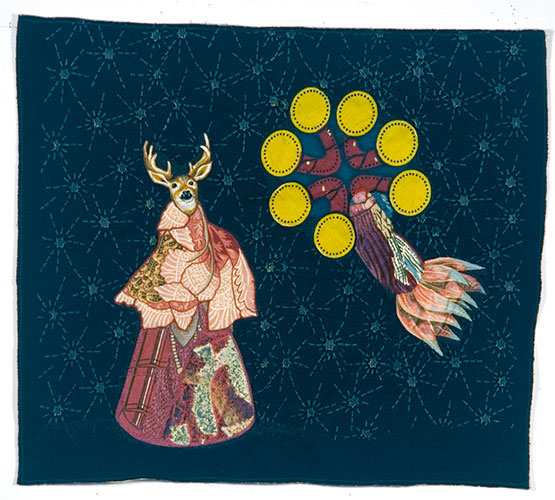
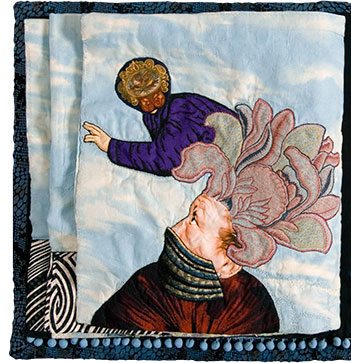
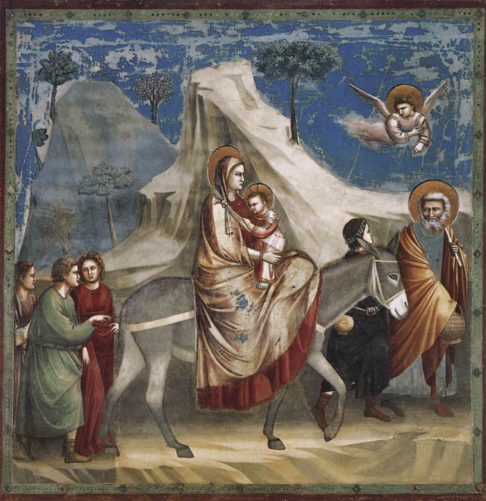
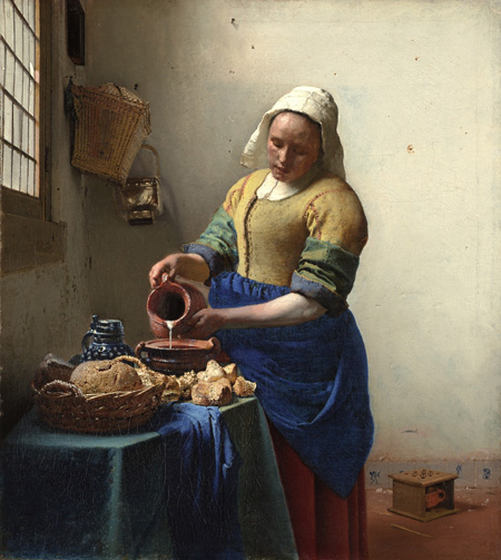
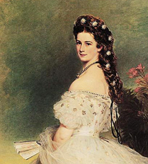
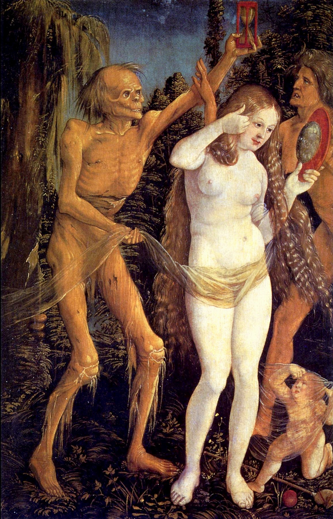
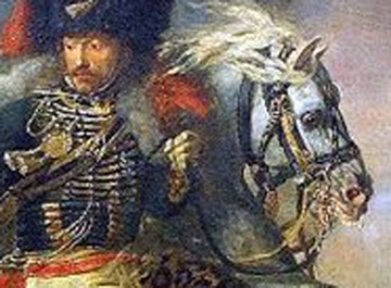